CSS grid
The CSS grid property is a shorthand property for various grid properties.
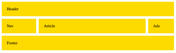
If your browser supports CSS grids, the above example should look like this:
The grid property is a convenient way to set several grid properties at once within your code. It relieves you from having to write out each property name individually.
The grid property sets the following properties:
- Explicit Grid Properties
- Implicit Grid Properties
- Gutter Properties
Note that you can only set the explicit or implicit properties within a single grid declaration. Any subproperties you don't specify are set to their initial values.
Examples
Here's a code example to demonstrate how the grid shorthand property works.
This example, and others are explained below.
Using the repeat() Function
You can use the repeat() function to repeat a row or column definition as many times as required. The first parameter specifies how many occurrences of the definition should be displayed, and the second parameter specifies the track list.
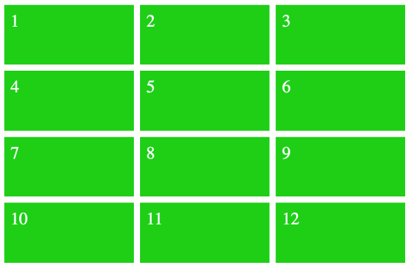
3 Columns
In this example, we use the repeat() function to explicitly state how many columns should be displayed, and we apply auto-flow to the row. Applying auto-flow value to the row is the equivalent of using grid-auto-flow: row.
The result is that the grid contains 3 columns, and it has as many rows as it needs to fit all the grid items.
Here's a working example:
The above code results in the following grid:
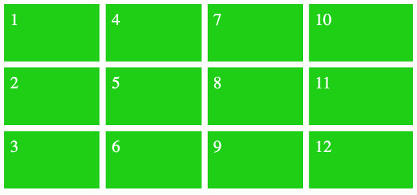
3 Rows
This example is the same as the above example, except that we swap it around. Here, we explicitly specify how many rows the grid has, and we set auto-flow on the columns (the equivalent of grid-auto-flow: column).
Here's a working example:
The above code results in the following grid:
Using the "ASCII art" Syntax
The grid-template-areas property allows you to define the template areas using a kind of "ASCII art" syntax. This makes it extremely easy to visualize your grid, as the ASCII art represents exactly how the grid is laid out.
Seeing as grid-template-areas is one of the properties covered by the grid property, you can provide the ASCII art straight to the grid property.
The way it works is, you create a text-based grid using named grid areas. If a grid area is wider or taller than others, you simply repeat that name across (or down) the grid.
The named grid areas are provided as a series of strings, each one representing a different row.
Like this:
Here's a working example:
The above code results in the following grid:
Named Lines
You can also modify the above example to use named lines, like this:
Named lines can make the grid easier to understand, as you can provide meaningful names to all of the lines in the grid.
Named lines can be either explicit or implicit.
-
Explicit named lines are where you provide the names. These can be specified as part of the
grid-template-rowsandgrid-template-columnsproperties (which are both covered by thegridshorthand property). -
Implicit named lines are names that are automatically created from the
grid-template-areasproperty. These named lines are created from the named grid areas in the template.For each named grid area named foo, four implicit named lines are created. Two named
foo-startname the row-start and column-start lines of the named grid area, and two namedfoo-endname the row-end and column-end lines of the named grid area.
Named lines are specified using a custom-ident value (a user defined identifier).
Syntax
Here's the official syntax of the grid property:
These values are explained below.
Possible Values
- 'grid-template'
- This value sets the
grid-templateproperty (which is shorthand for thegrid-template-rows,grid-template-columns, andgrid-template-areasproperties). - 'grid-template-rows' / [ auto-flow && dense? ] 'grid-template-columns'?
-
This value sets up auto-flow by setting the row tracks explicitly via the
grid-template-rowsproperty (and setting thegrid-template-columnsproperty tonone) and specifying how to auto-repeat the column tracks viagrid-auto-columns(and settinggrid-auto-rowstoauto). Thegrid-auto-flowproperty is also set tocolumnaccordingly, withdenseif it's specified.All other grid sub-properties are reset to their initial values.
- [ auto-flow && dense? ] 'grid-template-rows' / 'grid-template-columns'?
-
This value sets up auto-flow by setting the column tracks explicitly via the
grid-template-columnsproperty (and setting thegrid-template-rowsproperty tonone) and specifying how to auto-repeat the row tracks viagrid-auto-rows(and settinggrid-auto-columnstoauto). Thegrid-auto-flowproperty is also set torowaccordingly, withdenseif it's specified.All other grid sub-properties are reset to their initial values.
In addition, all CSS properties also accept the following CSS-wide keyword values as the sole component of their property value:
initial- Represents the value specified as the property's initial value.
inherit- Represents the computed value of the property on the element's parent.
unset- This value acts as either
inheritorinitial, depending on whether the property is inherited or not. In other words, it sets all properties to their parent value if they are inheritable or to their initial value if not inheritable.
Basic Property Information
- Initial Value
- As each of the properties of the shorthand. These are:
grid-template-rows:nonegrid-template-columns:nonegrid-template-areas:nonegrid-auto-rows:autogrid-auto-columns:autogrid-auto-flow:rowgrid-column-gap:0grid-row-gap:0
- Applies To
- Grid containers
- Inherited?
- No (i.e. none of the shorthand properties are inherited)
- Media
- Visual
- Animation type
- Discrete (see example)
CSS Specifications
- The
gridproperty is defined in CSS Grid Layout Module Level 1 (W3C Candidate Recommendation, 9 February 2017).
Browser Support
The following table provided by Caniuse.com shows the level of browser support for this feature.
Vendor Prefixes
For maximum browser compatibility many web developers add browser-specific properties by using extensions such as -webkit- for Safari, Google Chrome, and Opera (newer versions), -ms- for Internet Explorer, -moz- for Firefox, -o- for older versions of Opera etc. As with any CSS property, if a browser doesn't support a proprietary extension, it will simply ignore it.
This practice is not recommended by the W3C, however in many cases, the only way you can test a property is to include the CSS extension that is compatible with your browser.
The major browser manufacturers generally strive to adhere to the W3C specifications, and when they support a non-prefixed property, they typically remove the prefixed version. Also, W3C advises vendors to remove their prefixes for properties that reach Candidate Recommendation status.
Many developers use Autoprefixer, which is a postprocessor for CSS. Autoprefixer automatically adds vendor prefixes to your CSS so that you don't need to. It also removes old, unnecessary prefixes from your CSS.
You can also use Autoprefixer with preprocessors such as Less and Sass.