Single-Column Form Layout Template
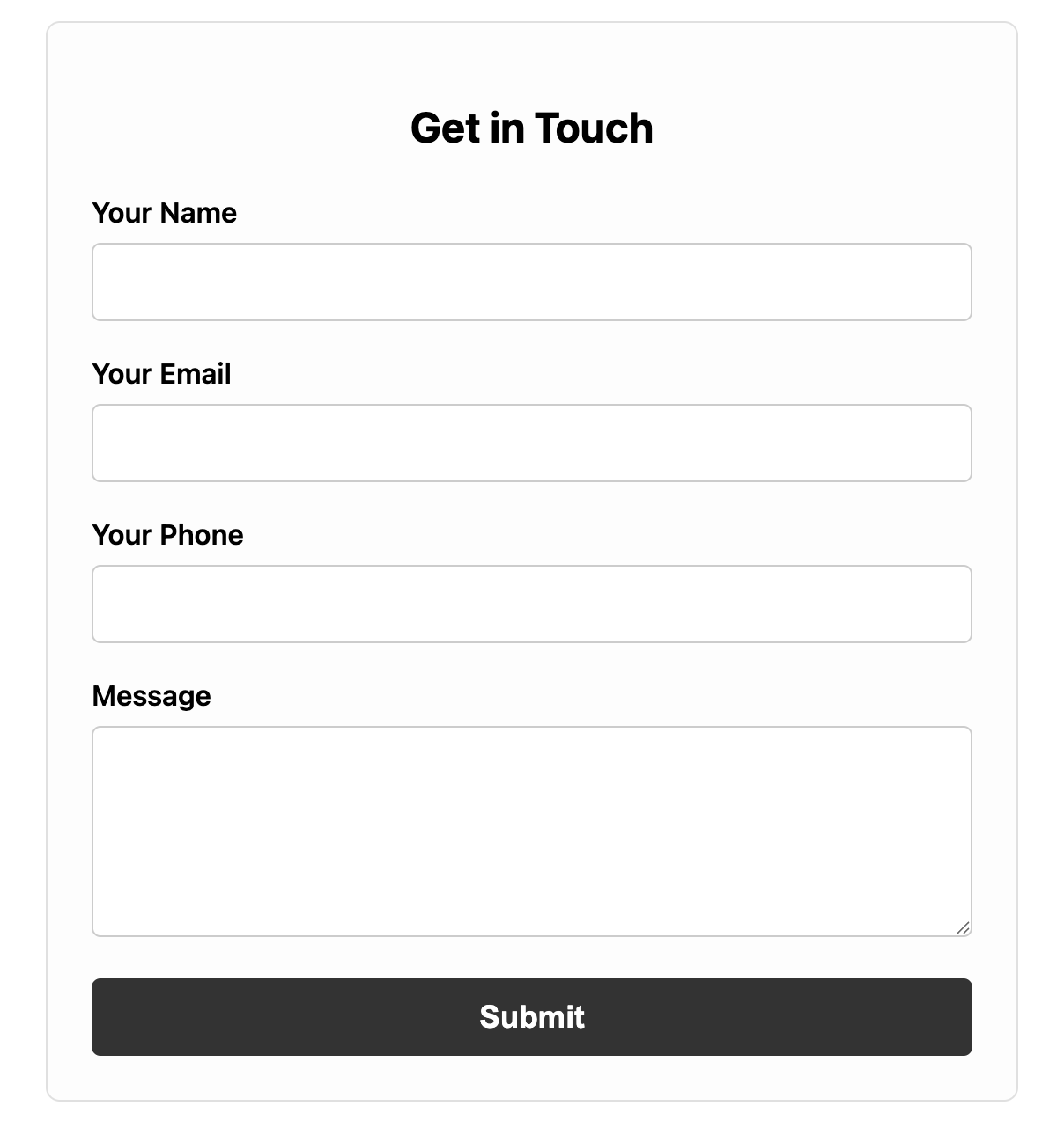
The gold standard for mobile-first and user-friendly form design: the single-column layout.
This foundational layout arranges all labels and inputs vertically, creating a clear, simple path for the user to follow, which is proven to improve completion rates.
About this Single-Column Layout Form
The single-column form is the most robust and widely recommended layout for most use cases. By presenting one field per row, it creates a clear vertical rhythm that guides the user's eye naturally down the page. This eliminates the back-and-forth scanning required by multi-column forms and dramatically simplifies the user experience, especially on mobile devices where horizontal space is limited.
This template provides a simple, well-structured, and aesthetically pleasing example that can be used as the base for almost any type of form, from contact forms to complex registration flows.
Features
- Mobile-First by Design: The single-column structure is inherently responsive and works perfectly on all screens.
- Improved Usability: A straight, linear path reduces cognitive load and makes the form faster for users to complete.
- Simple, Predictable Structure: Each form field is wrapped in a
divfor easy styling and logical grouping. - Universal Compatibility: This is the simplest layout to implement and the least likely to cause cross-browser issues.
Ideal Use Cases
- Almost any form, especially long or complex ones.
- Checkout processes, registration forms, and detailed contact forms.
- Situations where mobile usability is the top priority.
Dependencies
None. This is achieved with pure HTML and CSS.
Code
Here's the full code for the single-column form layout: