Form with Custom Button Styles Template
Enhance your forms with this versatile library of button styles.
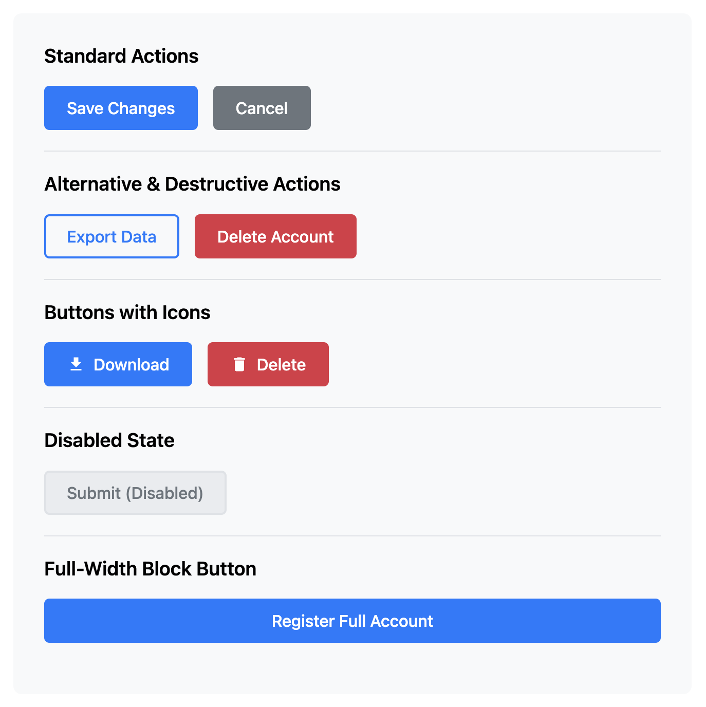
This template provides a collection of common button designs that you can drop into any form to create a clear visual hierarchy for user actions. Styles include "primary", "secondary", "disabled", as well as a couple of icons to help out.
About these Button Styles
Buttons are the primary call-to-action in most forms, and their design can significantly impact user behavior. Providing a clear visual distinction between different types of actions is crucial for good UI design. This template offers a reusable set of CSS classes for common button patterns.
Features
- Visual Hierarchy: Clear styles for Primary (the main action, e.g., "Submit"), Secondary (an alternative action, e.g., "Cancel"), and Outline buttons.
- State Variations: Includes styles for "hover", "focus", and "disabled" states, which are essential for a good user experience.
- Flexible & Reusable: The class-based system makes it easy to apply any style to a
buttonoratag. - Icon Buttons: Includes an example of pairing an icon with text for buttons that require extra visual context.
Ideal Use Cases
- Establishing a consistent button design system for a website or application.
- Providing clear user choices in forms (e.g., "Save" vs. "Save and Continue").
- Creating disabled buttons that become active once a form is valid.
Dependencies
None. This template uses only pure HTML and CSS.
Code
Here's the full code for the custom button styles: