Pill-Shaped Inputs Form Template
Give your forms a soft, modern, and friendly feel with these pill-shaped input fields.
This popular design trend uses a large border-radius value to create fully rounded text inputs and buttons, perfect for contemporary, approachable user interfaces.
About this Pill-Shaped Form Style
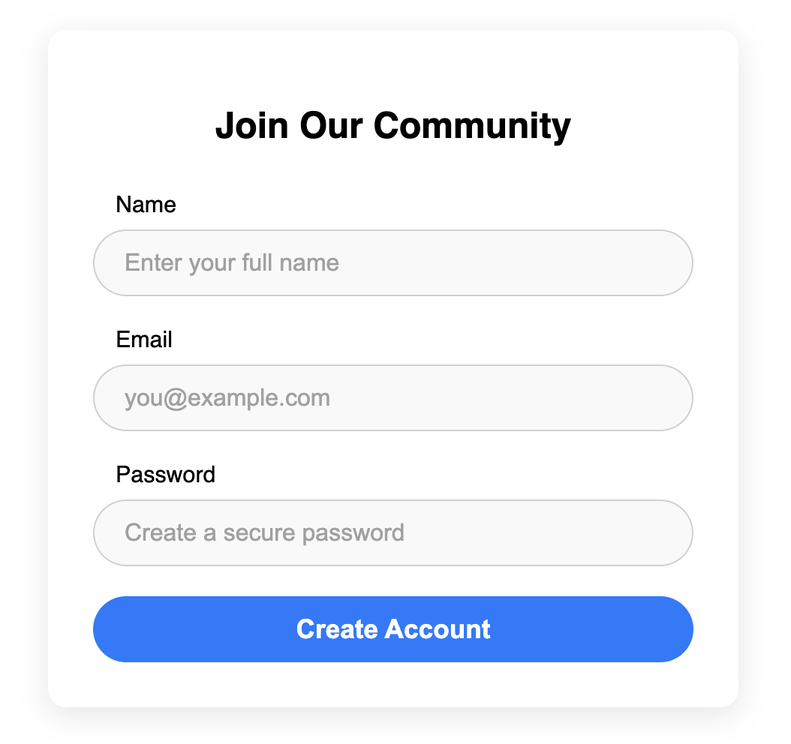
The "pill" or "capsule" shape is a simple yet effective way to modernize a standard form. The entire effect is achieved with a single CSS property: border-radius. By setting this to a large value (e.g., 50px), the corners of the input field are curved into a full semi-circle, creating the distinctive shape. This style is often associated with friendly, consumer-facing brands and SaaS platforms.
This template applies the pill shape not only to the input fields but also to the submit button, creating a cohesive and consistent design language for the entire form.
Features
- Modern & Friendly Aesthetic: The soft, rounded shapes are approachable and feel contemporary.
- Simple CSS Implementation: Achieved easily with the
border-radiusproperty. - Cohesive Design: Applies the style to all form elements for a unified look.
- Highly Customizable: Easily change colors and sizes to fit your brand.
Ideal Use Cases
- Sign-up and login forms for modern web apps.
- Search bars or newsletter subscription forms.
- Any UI where a soft and friendly design is a priority.
Dependencies
None. This template uses only pure HTML and CSS.
Code
Here's the full code for the form with pill-shaped inputs:
<style>.pill-form-container { max-width: 400px; margin: 40px auto; padding: 30px; background-color: #fff; border-radius: 12px; box-shadow: 0 5px 20px rgba(0,0,0,0.1); font-family: 'Poppins', sans-serif;}@import url('https://fonts.googleapis.com/css2?family=Poppins:wght@400;500;600&display=swap');.pill-form-container h2 { text-align: center; font-weight: 600; margin-bottom: 30px;}.form-group { margin-bottom: 20px;}.form-group label { display: block; font-weight: 500; margin-bottom: 8px; padding-left: 15px; /* Indent label slightly */ font-size: 0.95rem;}/* -- The Pill Shape Style -- */.form-group input { width: 100%; padding: 12px 20px; border: 1px solid #d0d0d0; background-color: #f9f9f9; font-size: 1rem; box-sizing: border-box; /* This creates the pill shape */ border-radius: 50px; transition: all 0.2s ease;}.form-group input::placeholder { color: #a0a0a0;}.form-group input:focus { outline: none; border-color: #007bff; background-color: #fff; box-shadow: 0 0 0 3px rgba(0, 123, 255, 0.2);}/* -- End Pill Shape Style -- */.submit-btn { width: 100%; padding: 12px 20px; border: none; background-color: #007bff; color: white; font-size: 1.1rem; font-weight: 600; cursor: pointer; /* Apply the pill shape to the button too */ border-radius: 50px; transition: background-color 0.2s;}.submit-btn:hover { background-color: #0069d9;}</style><div class="pill-form-container"> <h2>Join Our Community</h2> <form action="#" method="post"> <div class="form-group"> <label for="pill-name">Name</label> <input type="text" id="pill-name" name="name" placeholder="Enter your full name" required> </div> <div class="form-group"> <label for="pill-email">Email</label> <input type="email" id="pill-email" name="email" placeholder="you@example.com" required> </div> <div class="form-group"> <label for="pill-password">Password</label> <input type="password" id="pill-password" name="password" placeholder="Create a secure password" required> </div> <button type="submit" class="submit-btn">Create Account</button> </form></div>