Inline Form Layout Template
Save vertical space with this compact inline form, perfect for headers and toolbars.
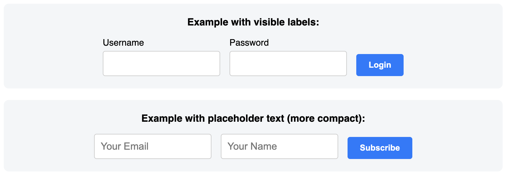
This layout uses CSS Flexbox to align multiple form elements horizontally on a single line, ideal for simple login, search, or subscription inputs.
About this Inline Form Layout
An inline form is the go-to solution when you need a form to be as compact as possible. Unlike traditional vertical forms, all elements are arranged horizontally. This template achieves the layout using display: flex; on the parent form element. This makes it easy to align all child elements (labels, inputs, buttons) neatly next to each other.
To ensure accessibility for a form that doesn't have visible labels, this template uses the sr-only (screen-reader only) class to visually hide the label elements. The placeholder attribute on each input provides the visual cue for sighted users, while the hidden labels provide essential context for assistive technologies.
Features
- Compact Horizontal Layout: Perfect for areas with limited vertical space, like page headers.
- Modern Flexbox Implementation: Uses
display: flexand gap for clean alignment and spacing. - Accessible Design: Incorporates visually-hidden labels to ensure screen readers can properly interpret the form fields.
- Responsive Ready: Includes an example of how the form can wrap or stack on smaller screens if needed.
Ideal Use Cases
- Simple login forms in a website's top navigation bar.
- Search bars.
- Quick-subscribe newsletter forms in a compact area.
Dependencies
None. This template uses only pure HTML and CSS.
Code
Here's the full code for the inline form template: