Modal/Popup Form Template
Capture user attention for important actions like login or newsletter signups with a clean modal form.
This self-contained component provides everything you need: a trigger button, a semi-transparent overlay, and a modal dialog window with a close button and a sample form.
About this Modal Form
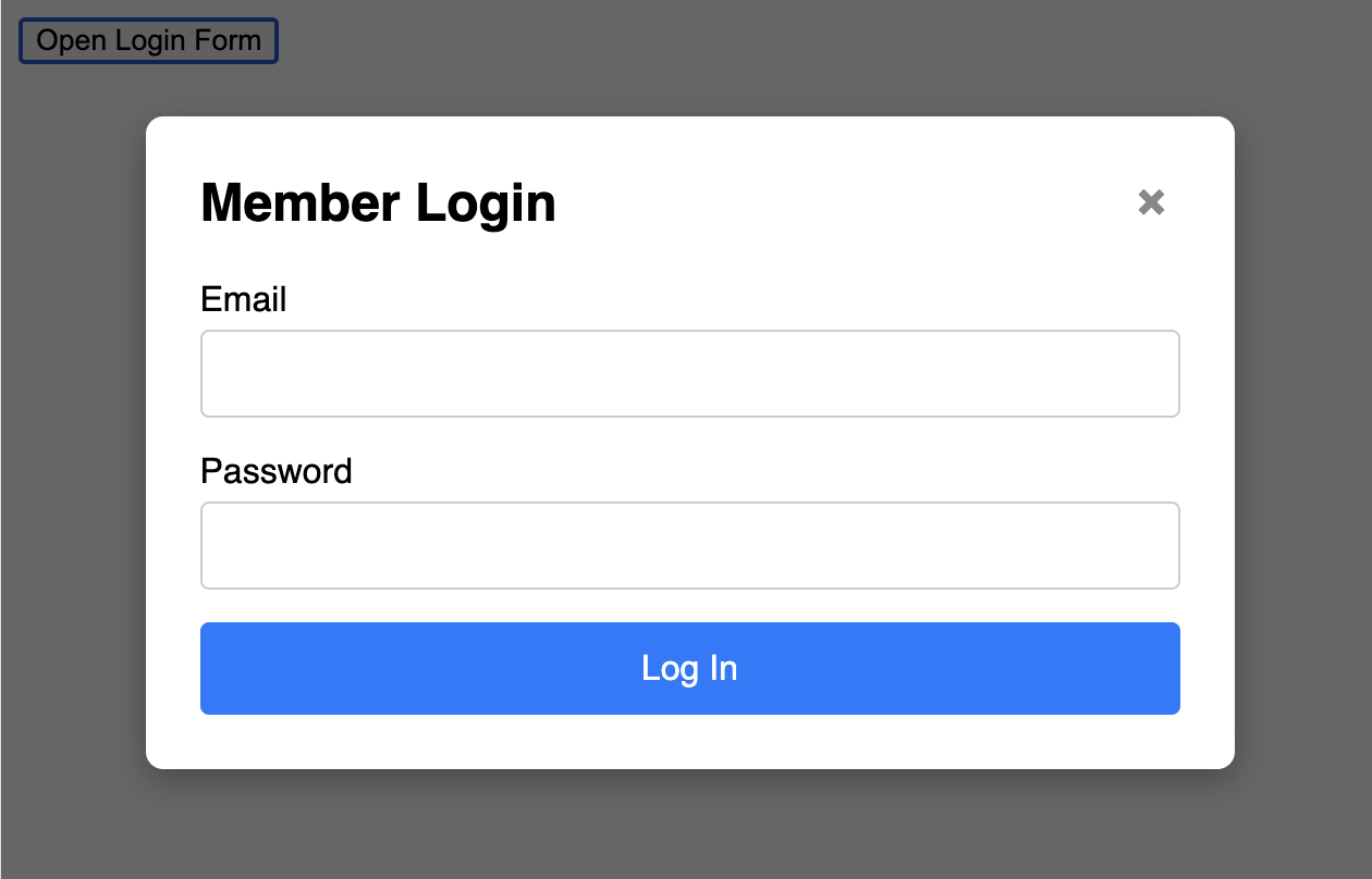
A modal (or popup) is a dialog box that appears on top of the main page content, which is usually dimmed in the background with an overlay. This is a very effective pattern for focused tasks, as it prevents the user from interacting with the rest of the page until the modal is dealt with.
This template is built with accessibility and usability in mind:
- The Trigger: A simple
buttonis used to open the modal. - The Modal Structure: The modal itself is a
divcontaining an overlay, the dialog content, a close button, and the form. It is hidden by default with CSS. - The JavaScript: A small script handles the logic. It adds event listeners to the trigger button to open the modal, and to the close button and overlay to close it. It also listens for the "Escape" key for dismissal, which is an important usability feature.
Features
- Self-Contained Component: The HTML, CSS, and JS work together as a single unit.
- Multiple Close Options: The modal can be closed by clicking the X button, clicking the background overlay, or pressing the Escape key.
- Accessibility Considered: Uses ARIA attributes like
role="dialog"andaria-modal="true"to describe the modal's purpose to assistive technologies. - CSS Transitions: A subtle fade-in effect is included for a smoother appearance.
Dependencies
Uses pure HTML and CSS, with a necessary, self-contained JavaScript block to function.
Code
Here's the full code for the modal/popup form: