Two-Column Form Layout Template
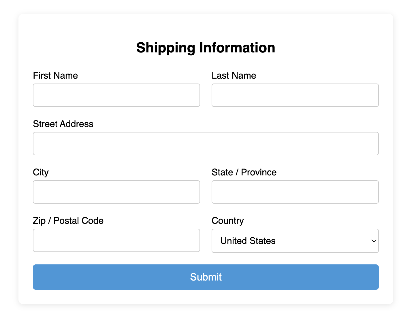
Create a compact, grid-like form layout for desktops with this responsive two-column template.
Using CSS Flexbox, this layout places related fields side-by-side on wider screens, then automatically stacks them into a single, mobile-friendly column on narrow screens.
About this Two-Column Layout Form
While a single column is often best, a two-column layout can be very effective for grouping short, related inputs and saving vertical space on desktop monitors. This template achieves this responsive behavior with modern CSS.
The fields you want to appear side-by-side are wrapped in a container div. This container is styled with display: flex; which arranges its children horizontally. A gap property creates space between them. A CSS media query then targets smaller screens and changes the container's flex-direction to column, seamlessly stacking the fields for a perfect mobile view. This approach is superior to older methods using floats, as Flexbox provides much better control over alignment and spacing.
Features
- Space-Efficient Desktop View: Reduces the form's overall height on wider screens.
- Fully Responsive: Automatically stacks to a single column on mobile, ensuring a great user experience everywhere.
- Modern CSS: Built with Flexbox, the modern standard for this type of layout.
- Flexible: You can mix and match two-column rows with full-width, single-column rows within the same form.
Ideal Use Cases
- Forms with short, related fields like First/Last Name, City/State, or Start/End Dates.
- Billing and shipping address forms.
- Complex configuration or settings pages in web applications.
Dependencies
None. This template uses only pure HTML and CSS.
Code
Here's the full code for the responsive two-column form layout: