Styled Radio Buttons Template
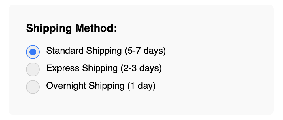
Achieve a consistent, branded look by replacing default browser radio buttons with a custom style.
Using a pure CSS technique, this template visually hides the native radio button but uses its state to style a custom element, giving you full control over the design while maintaining all accessibility features.
About these Styled Radio Buttons
Just like checkboxes, default browser radio buttons lack styling options and look inconsistent across different platforms. This template provides a robust solution to create a beautiful, uniform look for radio button inputs.
The technique is almost identical to styling checkboxes:
- The actual
input type="radio"is visually hidden but remains functional and part of its group (defined by thenameattribute). - A
labelcontains the input and a custom-styledspanwhich acts as the visible circular button. - A CSS pseudo-element (
::after) is used to create the inner "dot", which is hidden by default. - When the hidden input is checked (
input:checked), we use the adjacent sibling selector (+) to reveal the inner dot within our custom element. The outer ring's border color can also be changed.
This creates a clean, interactive radio button that is fully accessible via keyboard (tab and arrow keys) and to screen readers, as the native input is still being controlled.
Features
- Fully Customizable: Easily change the size, colors, and border of the radio buttons with CSS.
- Pure CSS Solution: The interactive state changes are handled entirely by CSS selectors.
- Accessible by Default: Preserves all the native functionality of radio buttons, including keyboard navigation within a group.
- Consistent Cross-Browser Look: Ensures your radio buttons look the same everywhere.
Dependencies
None. This template uses only pure HTML and CSS.
Code
Here's the full code for the styled radio buttons: