Styled Checkboxes Template
Replace inconsistent browser defaults with beautiful, custom-styled checkboxes.
This pure CSS technique visually hides the default checkbox but uses its :checked state to style a custom element, giving you full control over the look and feel while retaining all accessibility features.
About these Styled Checkboxes
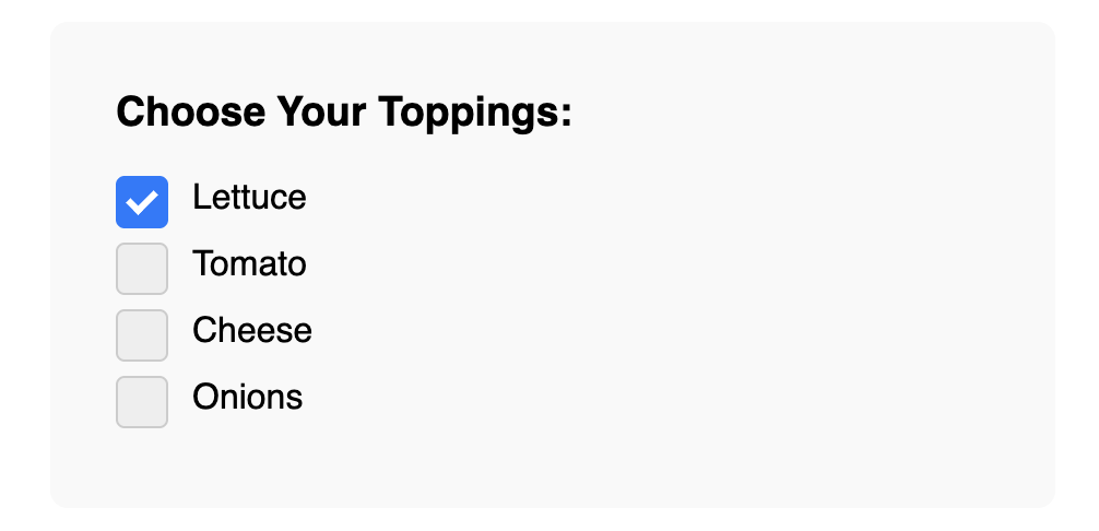
Default browser checkboxes are notoriously difficult to style and look different across operating systems and browsers. This template provides a robust, modern solution to create a consistent, branded appearance.
The method is as follows:
- The actual
input type="checkbox"is visually hidden but remains functional for accessibility. - A
labelis used to contain both the input and a custom-styledspanthat will serve as our visible "box". - A CSS pseudo-element (
::after) is used to create the checkmark, which is hidden by default. - When the hidden input is checked (
input:checked), we use the adjacent sibling selector (+) to target the custom box (e.g.,input:checked + .custom-box). We can then change its background color and make the checkmark pseudo-element visible.
This results in a beautiful, interactive checkbox that is still 100% accessible via keyboard and screen readers because the underlying native input is still being used.
Features
- Fully Customizable: Easily change the size, color, border, and checkmark style with CSS.
- Pure CSS Solution: No JavaScript is required for the functionality.
- Accessible: Because it's built upon a native checkbox, all functionality (like clicking the label to toggle) and accessibility features are preserved.
- Smooth Transitions: Includes subtle CSS transitions for a polished feel.
Dependencies
None. This template uses only pure HTML and CSS.
Code
Here's the full code for the styled checkboxes: