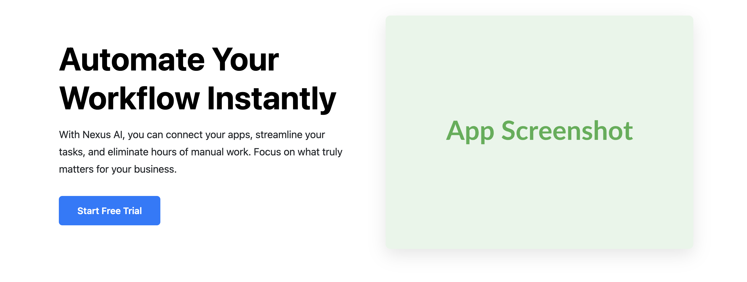
Two-Column Feature & Screenshot Hero Template
Clearly communicate your product's value with this balanced, feature-driven hero section layout.
This popular design for tech startups and SaaS companies pairs compelling marketing copy with a visual of your product in action.

About the Two-Column Feature Hero
This hero template is a staple for software, tech, and startup websites. It immediately answers two key questions for visitors: "What does this product do?" (via the text) and "What does it look like?" (via the screenshot). This approach effectively builds interest and encourages visitors to sign up or learn more.
Features
- Classic SaaS Layout: A time-tested design that clearly separates the value proposition from the visual proof.
- Action-Oriented Content: The text column is designed for a strong headline, a descriptive paragraph, and a clear call-to-action button.
- Fully Responsive: The two-column layout seamlessly transitions into a single-column stack on mobile devices for optimal readability.
- Simple Theming: All core styling elements like colors and fonts are controlled by CSS custom properties for quick customization.
Code Breakdown
This component consists of a CSS style block and an HTML section. Place the CSS in the head of your document (or in an external style sheet) and the HTML in the body where needed.
The entire layout is orchestrated by Flexbox. A parent .two-col-hero-container div is a flex container. By default (mobile-first), its flex-direction is column, which stacks the content and screenshot vertically. For wider screens, a media query changes the flex-direction to row. The two child divs, .two-col-hero-content and .two-col-hero-image-wrapper, are each given a flex-basis of 50% so they each take up half of the container's width, creating the split layout.