Split-Image Bio Hero Template
Present a polished and personal introduction with this split-screen hero for your bio and photo.
This layout is ideal for creative professionals, consultants, and freelancers who want to pair a welcoming image of themselves with a compelling summary of who they are and what they do.
About the Split-Image Bio Hero
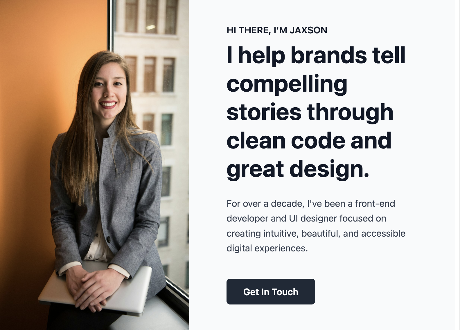
The split-screen design is a classic for a reason. It's balanced, aesthetically pleasing, and highly effective at presenting two distinct but related pieces of information. This template uses the layout to create an immediate connection with the visitor by showing a face, while simultaneously providing key biographical details and contact information.
Features
- Balanced Split Layout: Creates a visually appealing design that gives equal weight to your photo and your message.
- Responsive & Mobile-First: The image and text columns stack vertically on mobile devices for perfect readability.
- Image as Background: The photo is applied as a CSS background, making it easy to position and ensuring it doesn't distort.
- Simple to Customize: All colors, the background image, and font styles can be modified using the provided CSS custom properties.
Code Breakdown
The component is split into CSS for the head and HTML for the body of your website.
The main container .split-bio-hero uses Flexbox. A media query changes its flex-direction from column (on mobile) to row on screens 768px and wider. The two child divs, .split-bio-hero-image and .split-bio-hero-content, each have flex: 1, so they take up equal halves of the screen in the desktop view.
The personal photo is set as a CSS background image on the .split-bio-hero-image div. Using background-size: cover and background-position: center 25% makes the image robust and ensures it always looks good without being stretched or squeezed, regardless of the container's dimensions. Feel free to tweak this setting to better suit your photo.