Featured Brand/Product Line Hero Template
Put a special brand or product line in the spotlight with this elegant, focused hero layout.
This template uses a side-by-side design to combine brand messaging and a strong visual, guiding customers to a specific category or collection page.
About the Featured Brand Hero
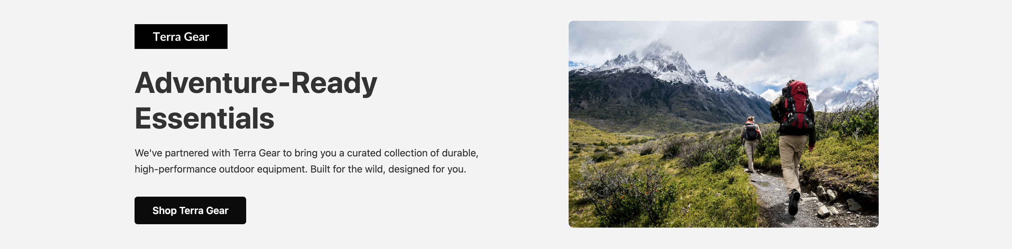
This hero section is ideal for e-commerce sites wanting to draw attention to a partnership with another brand, a new seasonal collection, or a specific category of items like "Outdoor Gear" or "Home Office Essentials". The layout prominently features a brand logo alongside a key message and visual.
Features
- Two-Column Layout: A balanced, split-screen design that presents brand information and a lifestyle image side-by-side on larger screens.
- Branding Focused: Includes a dedicated spot for a brand's logo to build recognition and trust.
- Responsive & Mobile-First: The columns stack neatly on mobile devices to ensure content is clear and accessible on any screen.
- Easy Theming: Colors, fonts, the brand logo, and the main image can all be modified easily through CSS custom properties.
Code Breakdown
This component is provided as two distinct code blocks: CSS for styling and HTML for structure. The CSS block should be placed in your document's head, while the HTML block belongs in the body.
The layout is managed by Flexbox. The main container, .featured-hero-container, has its display set to flex. On mobile, the default flex-direction: column stacks the content and image. A media query for screens 768px and wider changes this to row, creating the two-column effect.
Both the content (div) and the image wrapper (div) are flex items with flex: 1, causing them to share the available space equally in the two-column view. The content div itself is also a flex container to provide precise control over the alignment of the logo, text, and button.