Full-Screen Image Hero Template
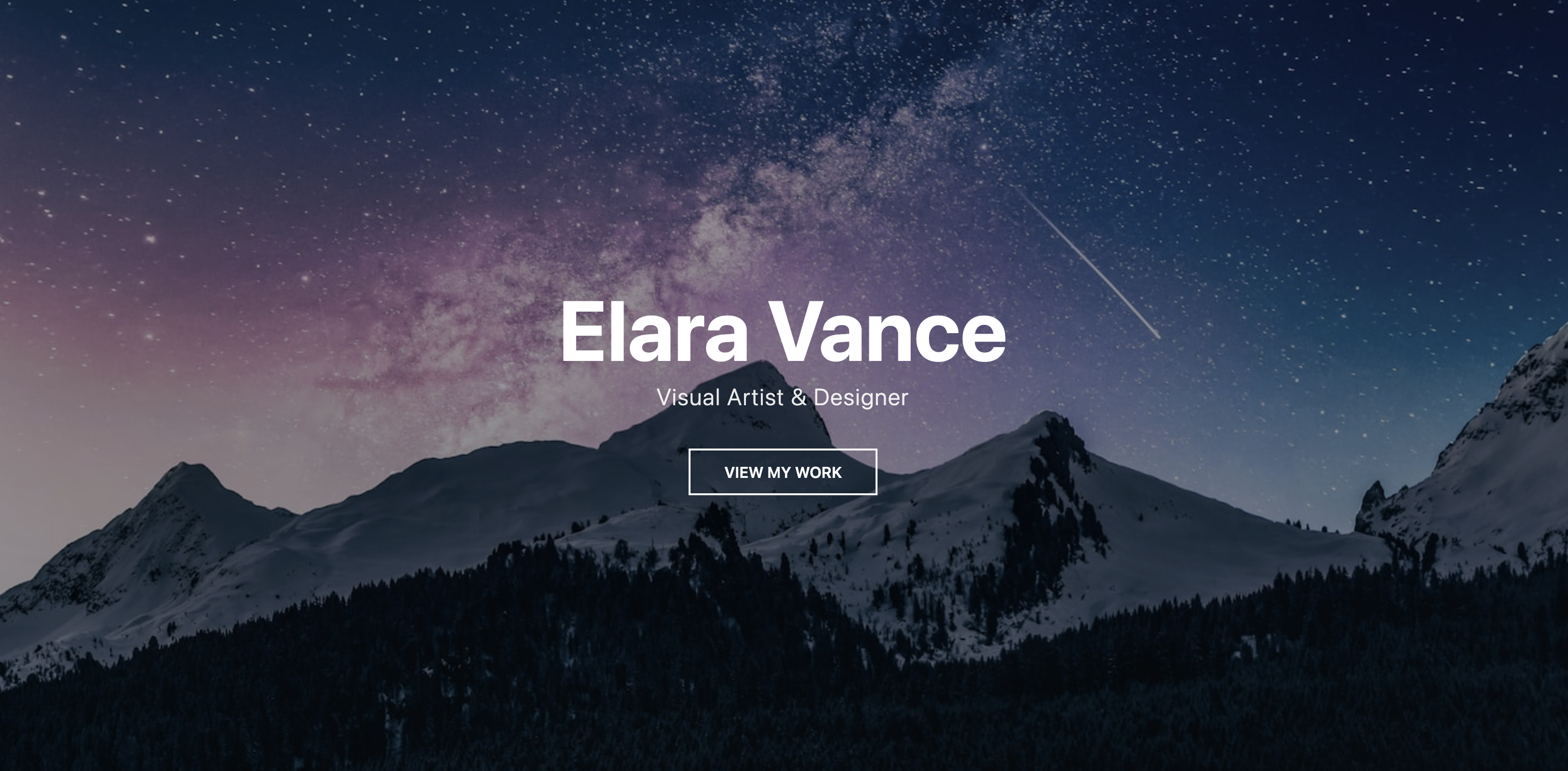
Create a powerful and immersive first impression with an elegant, full-screen background image.
This minimalist design is ideal for creative professionals who want to let their work speak for itself, framing their name and craft with a stunning visual.
About the Full-Screen Image Hero
This hero section provides a dramatic and stylish introduction for a personal portfolio website. By taking up the entire initial viewport, the background image immediately sets a mood and showcases the owner's aesthetic. The minimal text overlay keeps the focus on the visual, making it a perfect choice for photographers, designers, filmmakers, and other visual artists.
Features
- Immersive View: Uses a
min-heightof100vhto ensure the section fills the screen on load. - Text Legibility: A semi-transparent overlay is placed between the image and the text to ensure the content is readable, regardless of the background image's colors.
- Minimalist Design: The clean, centered text doesn't distract from the primary visual.
- Easy to Customize: The background image and overlay color can be easily changed via CSS custom properties.
Code Breakdown
The component is split into CSS for your site's head and HTML for the body.
The full-screen effect is achieved on the .fsi-hero section by setting min-height to 100vh (100% of the viewport height). The background image is applied with background-size: cover to ensure it always fills the space. A ::before pseudo-element creates the dark overlay. The text content is then perfectly centered, both horizontally and vertically, using a modern Flexbox layout (display: flex). The content itself has a higher z-index than the overlay, ensuring it sits on top.