Product Showcase Hero Template
Put your star product in the spotlight with this clean, conversion-focused hero section.
This template creates an immediate visual impact, drawing the user's attention directly to the product you want to feature.
About the Product Showcase Hero
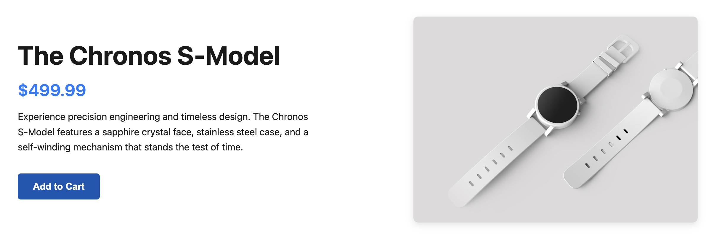
This hero section is designed for e-commerce websites that need to highlight a specific item. The layout is split into two columns on larger screens, dedicating one side to a large, high-quality product image and the other to essential details like the product name, price, description, and a prominent call-to-action (CTA) button.
Features
- Mobile-First Design: The layout stacks vertically on mobile devices for a seamless user experience and transitions to a side-by-side view on tablets and desktops.
- Image-Centric: A large area is reserved for a product image, making it the centerpiece of the section.
- Clear Information Hierarchy: The product name, price, and CTA are arranged to guide the user's eye toward the most important action.
- Self-Contained: All necessary styles are included within a
styleblock, making it easy to drop into any project without interfering with existing stylesheets.
Code Breakdown
The structure is built around a single parent section element to ensure it's a distinct part of the page. We use CSS Flexbox to control the layout. The main container has a display of flex, and its flex-direction is set to column by default for mobile devices.
A media query (@media (min-width: 768px)) adjusts the layout for larger screens by changing the flex-direction to row, creating the two-column appearance. The figure and content div inside the flex container each have a flex-basis of 50% to occupy equal space.
For accessibility, semantic tags like section, h1, and figure are used. The product image includes descriptive alt text, and the CTA is a standard button element, ensuring it's accessible to keyboard and screen reader users.