Newsletter Signup Hero Template
Grow your audience with a hero section designed to make newsletter signups effortless and immediate.
This template reduces friction by placing an email signup form "above the fold," a proven strategy for increasing conversions and building your mailing list.
About the Newsletter Signup Hero
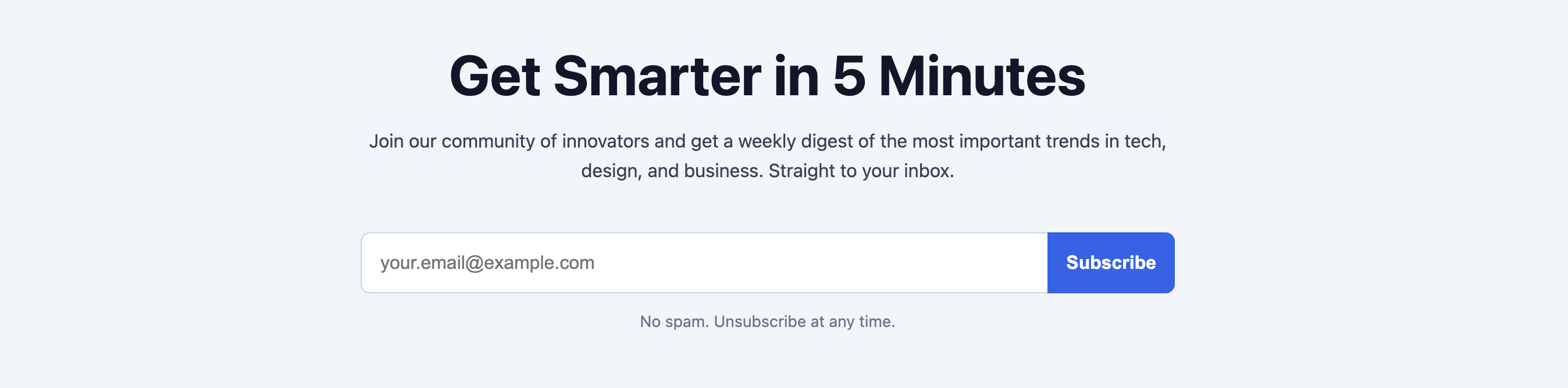
For content creators, SaaS companies, and e-commerce stores, a strong email list is a valuable asset. This hero section is laser-focused on growing that list. By making the signup process the most prominent element on the page, it encourages action. The design is clean and direct, which enables it to be easily branded to fit any website.
Features
- Integrated Signup Form: An email input and subscribe button are the central focus.
- Conversion-Oriented Design: The layout guides users directly from the value proposition to the sign-up action.
- Accessible Form: Includes a properly associated
labelfor the input field, which is visually hidden for a cleaner look. - Fully Responsive: The form input and button align neatly on desktop and stack gracefully on mobile.
Code Breakdown
The component is split into CSS for your site's head and HTML for the body.
The overall section is centered using Flexbox. The form itself is the most interesting part. It's also a flex container (display: flex). On mobile, flex-direction: column is used to stack the input and button. A media query for wider screens changes this to row, placing them side-by-side.
To create the unified "pill" shape on desktop, we manipulate the border-radius of the input and button. The input's right-side corners are set to zero, and the button's left-side corners are set to zero, so they fit together perfectly. The label is hidden using an sr-only (screen-reader only) utility class, which is a common accessibility practice.