Swipeable Mobile Menu Navbar Template
A mobile-first navigation pattern that allows users to swipe horizontally through a long list of navigation links.
This pattern is an excellent alternative to a traditional dropdown for sites with many categories, like news websites or large e-commerce stores. It provides quick, direct access to a long list of items without overwhelming the user.
This component is specifically designed and styled for mobile-sized viewports. On desktop, it simply presents as a standard horizontal navbar, as horizontal swiping is not a natural interaction for mouse users.
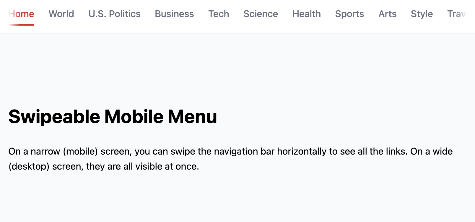
The Swipeable Mobile Menu
A mobile-first navigation pattern that allows users to swipe horizontally through a long list of navigation links. This is an ideal solution for websites with numerous categories (e.g., news sites, large blogs, e-commerce stores), as it keeps all links on a single, scrollable line without cluttering the screen or requiring a long dropdown.
- Touch-Friendly Horizontal Scrolling — On mobile viewports, the navigation list overflows its container, enabling native-like horizontal touch-scrolling. Subtle fade effects on the edges indicate to the user that more content is available.
- Clean, Minimalist Interface — This pattern keeps the header compact and clean, allowing more screen space for main content.
- Desktop Fallback: The swiping behavior is disabled on larger screens where it's not intuitive. The menu defaults to a standard, clean horizontal navigation bar.
- Built with Pure CSS: The core swiping mechanism is achieved entirely with modern CSS properties like
overflow-x: autoandscroll-snap-typefor a smooth, native-feeling scroll experience. - Scroll Snapping: Uses CSS Scroll Snap to ensure that when a user finishes swiping, the links "snap" into a clean alignment, rather than being awkwardly cut off mid-way.
Coding Best Practices
- CSS custom properties (variables) are used for easy theme customization (colors, fonts).
- The code is appropriately commented to explain the purpose of each section.
Code
Here's the full code for the navbar template: