Mega Menu Navbar Template
The "Mega Menu Navbar" is a popular choice, especially for large, content-rich websites. Mobile-responsive and accessible. Copy and paste the code straight into your own web projects.
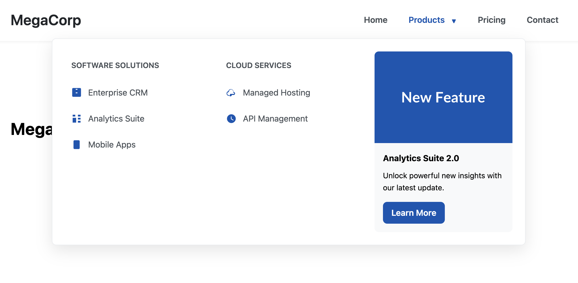
The Mega Menu Navbar
An advanced and highly practical navigation solution designed for large websites like e-commerce stores, news portals, or corporate sites. Instead of a simple dropdown, it reveals a large, multi-column panel on hover, allowing for grouped links, icons, and even promotional images.
- Key Feature: Multi-Column Layout — The dropdown panel uses CSS Grid to create a clean, organized, multi-column layout for displaying a large number of navigation links.
- Key Feature: Responsive & Accessible Fallback — On desktop, the mega menu appears on hover. On mobile, it intelligently transforms into a touch-friendly, accessible accordion, ensuring a great user experience on any device.
- Accessibility Focused: Built with ARIA attributes (
aria-expanded,aria-haspopup) and robust keyboard support. Users can open, navigate through, and close the menu entirely with a keyboard.
Coding Best Practices
- CSS custom properties (variables) are used for easy theme customization (colors, fonts).
- The code is appropriately commented to explain the purpose of each section.
- A tiny, efficient JavaScript snippet is used for the mobile menu toggle, as it is the most accessible and modern method (arguably superior to the older "checkbox hack").
Code
Here's the full code for the navbar template: