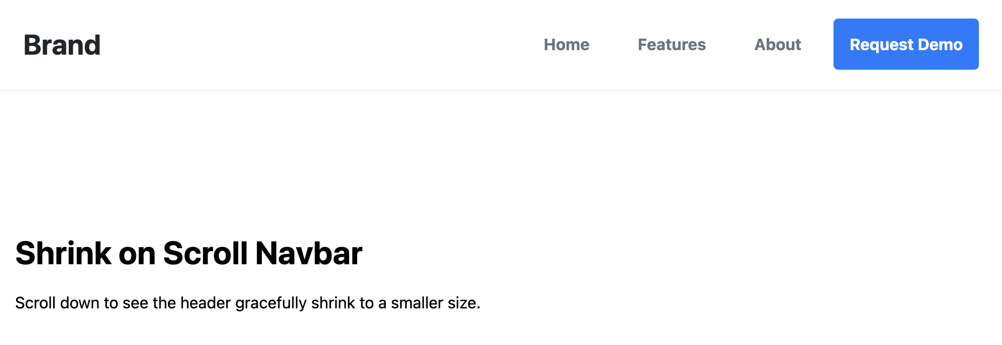
"Shrink on Scroll" Sticky Navbar Template
This navbar uses that "shrink on scroll" sticky effect, where it sticks to the top of the screen when the user scrolls and shrinks its height.
Get Source Code & Preview → Preview →
The "Shrink on Scroll" Sticky Navbar
A smart, user-friendly sticky navbar that starts at a larger, more prominent size and gracefully animates to a compact version when the user scrolls down the page. This saves valuable screen space while keeping navigation constantly accessible.
- Dynamic Shrinking Effect — JavaScript is used to detect the user's scroll position. After scrolling a small distance, a class is added to the navbar, triggering CSS transitions that smoothly reduce its height, padding, and font sizes.
- Smooth CSS Transitions — The change between the large and small states is not jarring. Smooth
transitionproperties are applied to height, font-size, and padding for a polished, premium feel. - Performant & Modern: It uses
position: stickyfor the best scrolling performance and relies on efficient JavaScript for detecting the scroll change. - Fully Responsive: The effect works perfectly on both desktop and mobile layouts, collapsing to a smaller hamburger menu that also shrinks with the bar.
Coding Best Practices
- CSS custom properties (variables) are used for easy theme customization (colors, fonts).
- The code is heavily commented to explain the purpose of each section.
- A tiny, efficient JavaScript snippet is used for the mobile menu toggle, as it is the most accessible and modern method (arguably superior to the older "checkbox hack").
Code
Here's the full code for the navbar template: