Dark Mode / Themed Navbar Template
Dark mode certainly has its devotees. Now you can cater for them with this dark mode / themed navbar. Mobile-responsive and accessible. Copy and paste the code straight into your own web projects.
The Dark Mode / Themed Navbar
A modern navbar that includes a fully functional theme switcher. It allows users to toggle between a light and dark mode, providing a comfortable viewing experience in any lighting condition. The component is built with modern best practices, including support for OS-level preferences and persistence.
- Persistent State — The user's theme choice (light or dark) is automatically saved in their browser's
localStorage, so their preference is remembered on their next visit. - OS Preference Aware — On a user's first visit, the navbar automatically detects and applies their operating system's theme preference (via
prefers-color-scheme). - No-Flash (FOUC) Script — A tiny script runs before the page loads to set the theme, preventing the flash of an incorrect theme on page load.
- Accessible Toggle — The theme switcher is an accessible button with clear SVG icons (sun and moon) that indicate the current state and action.
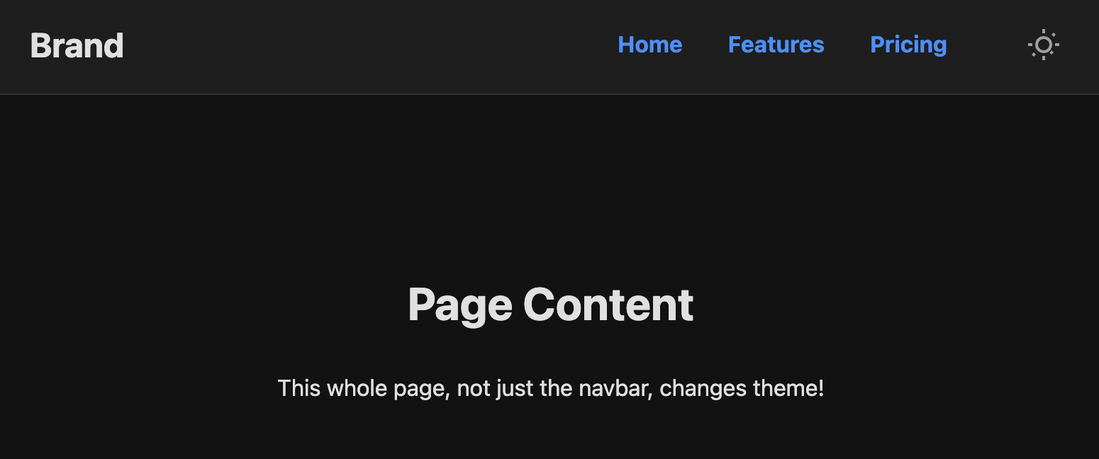
- Entire Page Theming: The CSS is structured with variables so that applying the theme to the entire page body—not just the navbar—is simple.
Coding Best Practices
- CSS custom properties (variables) are used for easy theme customization (colors, fonts).
- The code is heavily commented to explain the purpose of each section.
- A tiny, efficient JavaScript snippet is used for the mobile menu toggle, as it is the most accessible and modern method (arguably superior to the older "checkbox hack").
Code
Here's the full code for the navbar template: