Classic Hamburger to Dropdown Navbar Template
The quintessential responsive navbar that switches to a hamburger menu on smaller devices.
On desktop, it's a standard horizontal navbar. On mobile, links hide behind a hamburger icon that toggles a simple vertical dropdown menu.
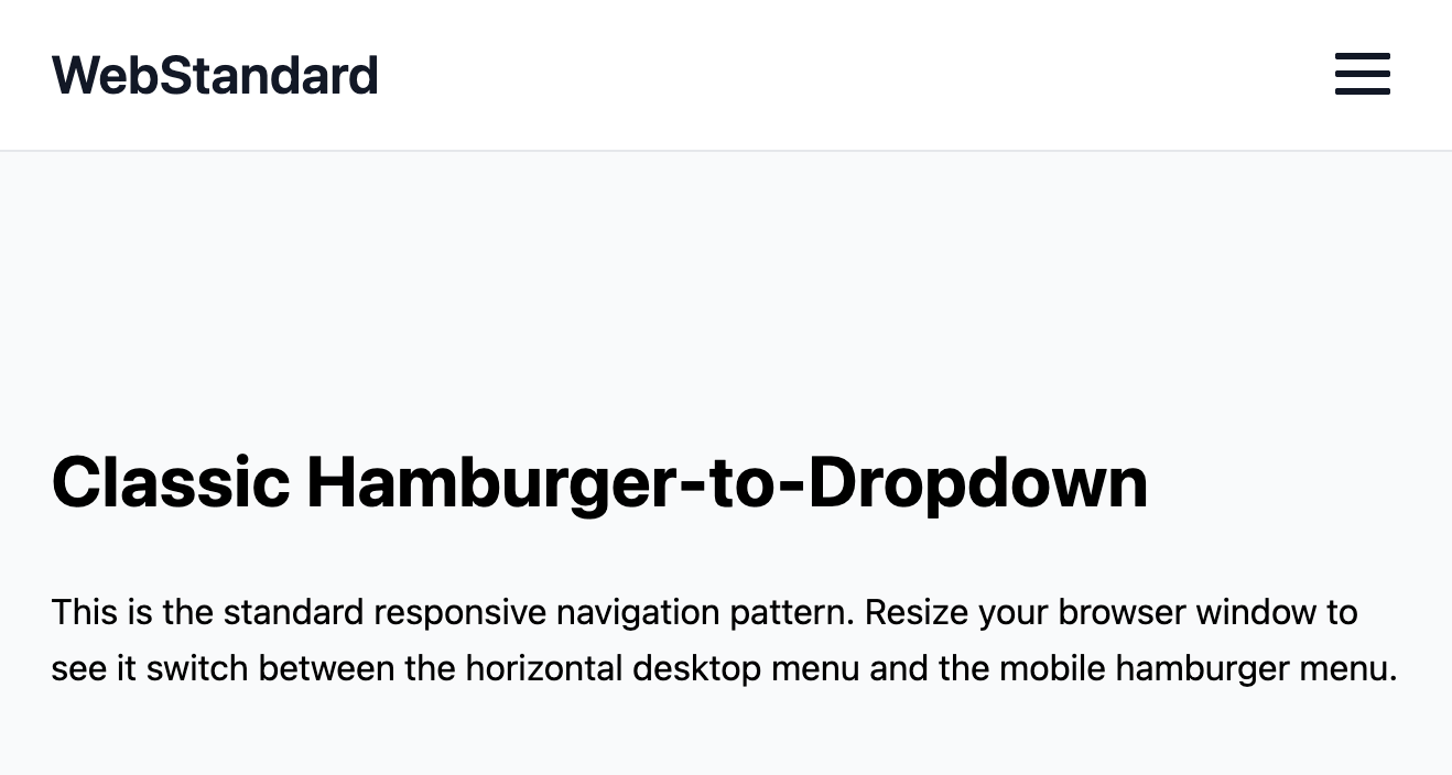
The Classic Hamburger-to-Dropdown
The quintessential responsive navigation pattern. On larger desktop screens, it displays as a standard horizontal bar of links. On smaller mobile screens, the links gracefully hide behind a "hamburger" icon, which toggles a clean, vertical dropdown menu. This is the most common and user-friendly approach for responsive websites.
- Seamless Responsive Transition — The layout fluidly transforms from horizontal to vertical at a specific breakpoint. The hamburger toggle button is only visible on mobile, and the horizontal link list is only visible on desktop.
- Clean Mobile-First CSS — The CSS is written with a "mobile-first" methodology. The base styles are for the mobile (dropdown) view, and a
min-widthmedia query then adds the styles for the desktop (horizontal) view. This is a modern best practice for maintainable CSS. - Accessible by Default: The toggle button is a proper
<button>element with the necessary ARIA attributes (aria-controls,aria-expanded) that are dynamically updated by JavaScript to ensure screen readers understand the menu's state. - Lightweight & Universal: Built with a minimal amount of HTML, CSS, and JavaScript, making it incredibly easy to integrate and customize for any project.
Coding Best Practices
- CSS custom properties (variables) are used for easy theme customization (colors, fonts).
- The code is appropriately commented to explain the purpose of each section.
- A tiny, efficient JavaScript snippet is used for the mobile menu toggle, as it is the most accessible and modern method (arguably superior to the older "checkbox hack").
Code
Here's the full code for the navbar template: