Collapsible Vertical Sidebar Template
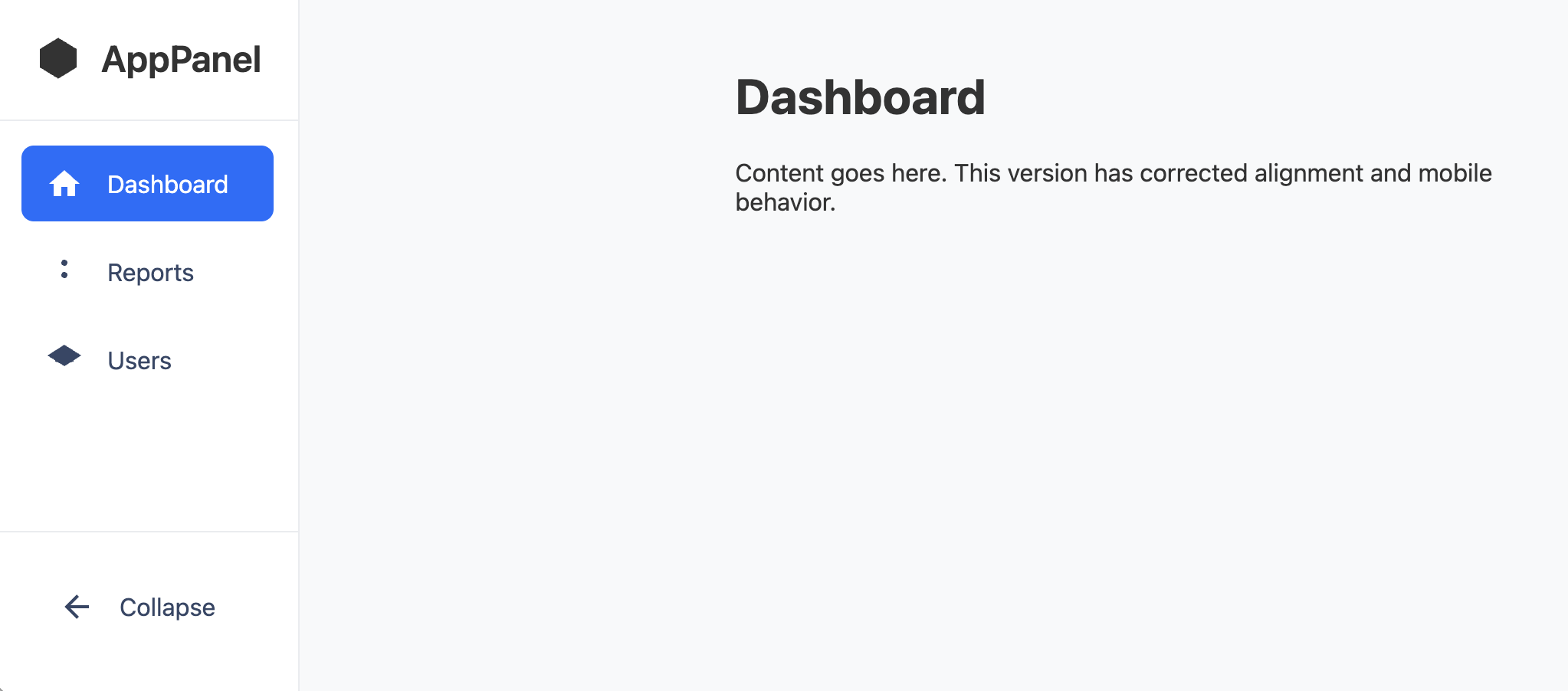
This collapsible navbar sits vertically on the left side of the page and collapses to a more compact sidebar at the user's click. Fully mobile-responsive and accessible.
The sidebar is a very common layout for web applications and dashboards. It provides persistent, easy-to-access navigation on large screens. This implementation also includes a "collapsible" state—a popular feature that shrinks the sidebar to an icon-only view, maximizing content space.
The Collapsible Vertical Sidebar
A persistent, vertical navigation sidebar, ideal for web applications, admin dashboards, or sites with a complex information architecture. On larger screens, it's always visible on the left. On mobile, it behaves like a standard off-canvas menu for a clean, focused experience.
- Icon-Only Collapse State — On desktop, the sidebar cleanly collapses to show only the brand and navigation icons. This state is saved in
localStorageto remember the user's preference. - Dynamic Toggle Arrow — The collapse button's arrow intelligently changes direction to indicate whether it will collapse or expand the menu, providing clear visual feedback.
- Responsive Transformation: On mobile, the sidebar is hidden off-canvas by default and is opened by a traditional hamburger button in a top header bar.
- Accessibility: All links have both an icon and clear text in the expanded view. The mobile view is fully accessible with focus management and keyboard controls.
Coding Best Practices
- CSS custom properties (variables) are used for easy theme customization (colors, fonts).
- The code is appropriately commented to explain the purpose of each section.
- A tiny, efficient JavaScript snippet is used for the mobile menu toggle, as it is the most accessible and modern method (arguably superior to the older "checkbox hack").
Code
Here's the full code for the navbar template: