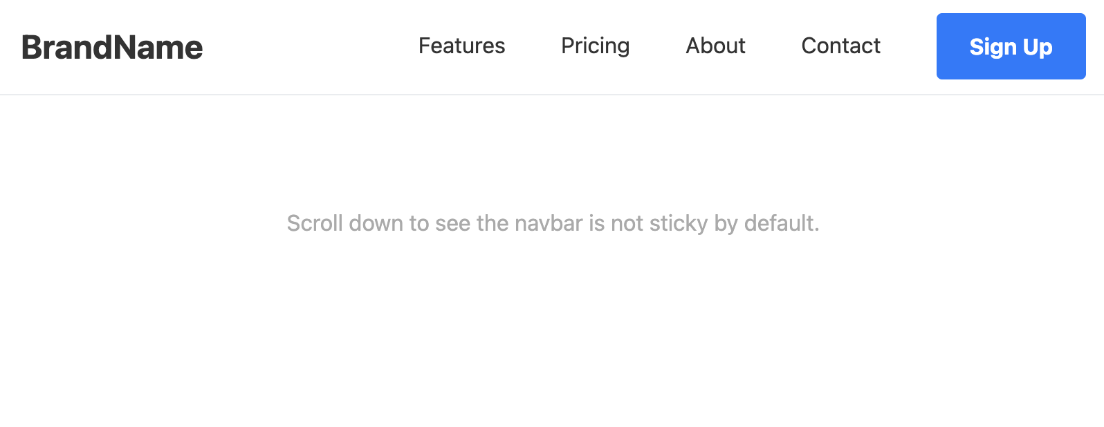
Minimalist Style Navbar Template
This minimalist navbar is mobile-responsive and accessible. Copy and paste the code straight into your own web projects.
Visual Features
Features of this navbar include clean lines, ample whitespace, and a simple sans-serif font. Links have a subtle bottom border on hover. No flashy animations.
Code Features
- Single File: All HTML, CSS, and necessary JavaScript are contained within one file for easy copy-pasting.
- Mobile-First & Responsive: The design works perfectly on small screens and gracefully expands to a traditional horizontal layout on larger screens.
- Accessible (WCAG 2.1 AA Compliant):
- Uses semantic HTML5 elements (
<header>,<nav>,<button>). - The mobile menu toggle button uses
aria-controls,aria-expanded, andaria-labelfor screen reader users. - Keyboard navigation is seamless, with logical tab order.
- Visible focus states (
:focus-visible) are provided for keyboard users, which don't trigger on mouse clicks. - Color contrast ratios for text on background meet AA standards.
- Uses semantic HTML5 elements (
- Best Practices:
- CSS custom properties (variables) are used for easy theme customization (colors, fonts).
- The code is heavily commented to explain the purpose of each section.
- A tiny, efficient JavaScript snippet is used for the mobile menu toggle, as it is the most accessible and modern method (superior to the older "checkbox hack").
- Minimalist Aesthetic: Clean, with generous whitespace, a modern sans-serif font stack, and subtle, non-distracting hover effects.
Code
Here's the full code for the navbar template: