Responsive Top Nav & Bottom Tab Bar Combo Template
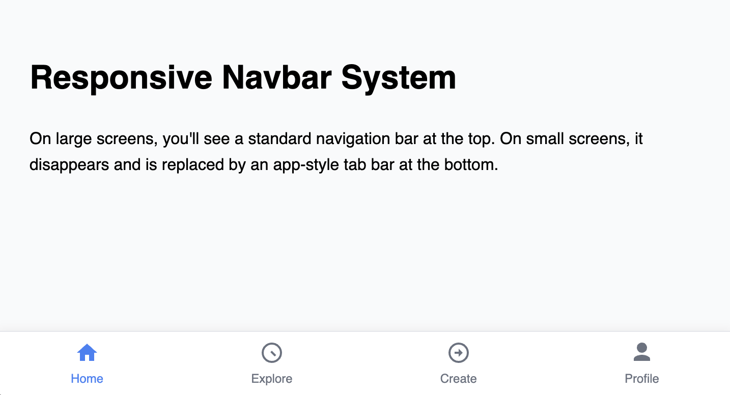
Responsive navigation system that features a traditional top navbar for desktop users and a native-style bottom tab bar for mobile users.
The Responsive Top Nav & Bottom Tab Bar Combo
A sophisticated, app-like navigation system that provides the best user experience for both desktop and mobile users. On desktop, it presents a clean, traditional navigation bar at the top of the page. On mobile viewports, the top navigation disappears and is replaced by an ergonomic, thumb-friendly tab bar fixed to the bottom of the screen.
- Two Distinct Navbars — This component includes two separate navigation elements in the HTML. CSS media queries are used to seamlessly toggle the visibility of the appropriate navbar based on the user's screen size.
- Ergonomic Mobile Tab Bar — The bottom tab bar is designed for easy one-handed use on mobile devices. Icons and labels are provided for clarity, and an "active" state is clearly indicated.
- Professional Desktop Navbar — A clean, classic top navigation bar is provided for an optimal desktop experience, featuring a standard layout that users will find familiar and easy to use.
- Space-Efficient: The bottom tab bar provides persistent navigation on mobile without taking up valuable vertical space at the top of the screen where content is most visible.
- Accessible: Each icon in the tab bar is accompanied by a visible text label and proper ARIA attributes to ensure full accessibility.
Coding Best Practices
- CSS custom properties (variables) are used for easy theme customization (colors, fonts).
- The code is appropriately commented to explain the purpose of each section.
Code
Here's the full code for the navbar template: