Search-Focused Navbar Template
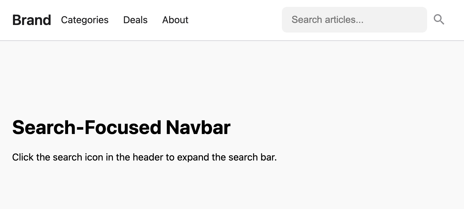
Search-focused navbar that features a prominent search icon that smoothly expands into a full search bar on click.
This navbar design is ideal for blogs, e-commerce sites, or any application where search is a primary user action. It keeps the interface clean by default but provides a large, accessible search input upon user interaction.
The Search-Focused Navbar
A modern and clean navbar that prioritizes the search function. It features a prominent search icon that smoothly expands into a full search bar on click. This pattern keeps the header uncluttered while making the search functionality immediately accessible and easy to use.
- Expanding Search Animation — The search input is hidden by default and smoothly animates to its full width when the user clicks the search icon.
- Smart Mobile Layout — On mobile devices, opening the search bar automatically hides other navigation elements to dedicate the entire header space to the search input.
- Fully Responsive — The component includes a standard, working hamburger menu for mobile navigation, which functions independently of the search feature.
- Accessible & Semantic: The component is built with proper HTML forms, and JavaScript is used to manage ARIA states and focus for both the search and mobile menu.
Coding Best Practices
- CSS custom properties (variables) are used for easy theme customization (colors, fonts).
- The code is appropriately commented to explain the purpose of each section.
- A tiny, efficient JavaScript snippet is used for the mobile menu toggle, as it is the most accessible and modern method (arguably superior to the older "checkbox hack").
Code
Here's the full code for the navbar template: