Centered Logo Navbar Template
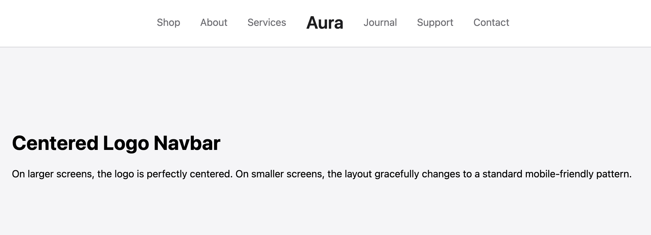
Navbar with the logo in the center, flanked on both sides by the menu items. Fully mobile-responsive and accessible.
This implementation uses a modern CSS Grid layout on desktop to achieve perfect, robust centering of the logo. On mobile, it gracefully reflows into a standard, user-friendly layout with the logo on the left and a hamburger menu on the right.
The Centered Logo Navbar
A classic, balanced, and aesthetically pleasing navbar layout where the brand logo sits perfectly in the center, flanked by navigation links. This symmetrical design is ideal for portfolios, boutiques, creative studios, or any brand wanting to put their logo front and center in a sophisticated way.
- Symmetrical Centered Layout — On desktop screens, this navbar uses a robust CSS Grid layout to precisely center the logo, with navigation items split evenly on either side for a clean, balanced look.
- Responsive Fallback — The design intelligently adapts to mobile devices. It transforms into the most user-friendly mobile pattern: logo on the left and a hamburger menu icon on the right, which toggles a vertical list of all navigation links.
- Clean Visual Hierarchy: The clear separation of links and the prominent logo create an intuitive and easy-to-navigate experience for users.
- Modern and Maintainable: Built with minimal code and CSS custom properties for easy customization. The use of CSS Grid ensures the layout is stable and maintainable.
Coding Best Practices
- CSS custom properties (variables) are used for easy theme customization (colors, fonts).
- The code is appropriately commented to explain the purpose of each section.
- A tiny, efficient JavaScript snippet is used for the mobile menu toggle, as it is the most accessible and modern method (arguably superior to the older "checkbox hack").
Code
Here's the full code for the navbar template: