Circular/Radial Menu Navbar Template
A highly stylized and visually unique navigation component.
This is a highly stylized and experimental navigation pattern. It sacrifices some traditional usability for a very memorable and unique user experience. It's best suited for specific use-cases like portfolios or interactive exhibits where a "wow" factor is desired. This implementation uses a pure CSS approach for the animations.
The Circular/Radial Menu
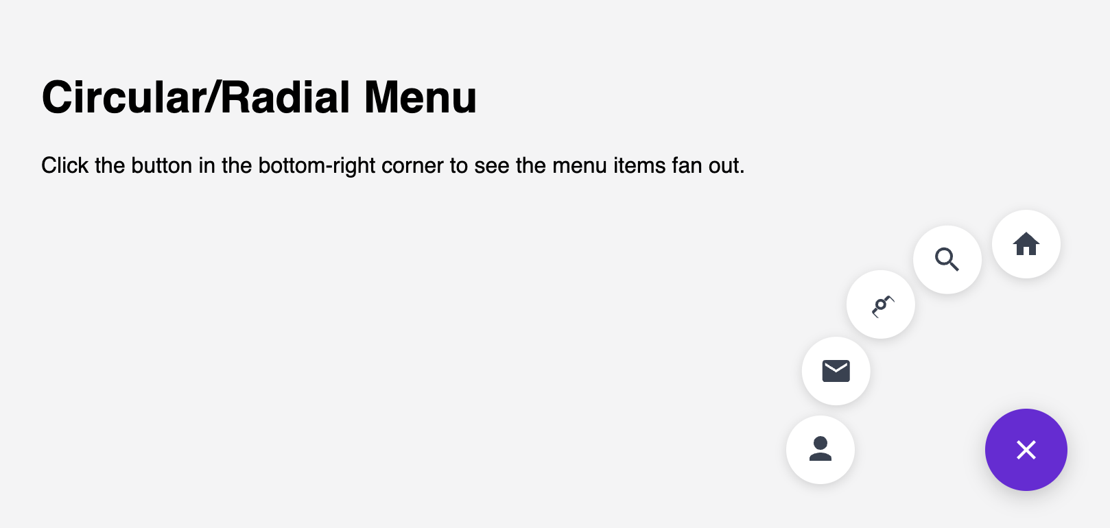
A highly stylized and visually unique navigation component. Instead of a traditional bar, links are hidden by default. Clicking a central "menu" icon causes the navigation links to dramatically fan out in a circle. This is an experimental pattern ideal for creative portfolios, special landing pages, or any site looking to create a memorable "wow" factor.
- Circular Reveal Animation — On click, navigation items animate outwards from a central point, arranging themselves in a perfect circle around the main button. This effect is achieved entirely with performant CSS transforms.
- Pure CSS Implementation — The core logic for showing, hiding, and positioning the menu items is handled with CSS, using the "checkbox hack" (an invisible checkbox manages the open/closed state). A small amount of JS can enhance it, but is not required for the effect itself.
- Icon-Based with Tooltips: The links are represented by clean SVG icons. For accessibility and usability, descriptive tooltips appear on hover to clarify each button's function.
- Fixed Positioning: The menu is fixed to a corner of the screen (e.g., bottom-right), keeping it accessible but out of the way of the main content, much like a "FAB" (Floating Action Button).
Coding Best Practices
- CSS custom properties (variables) are used for easy theme customization (colors, fonts).
- The code is appropriately commented to explain the purpose of each section.
Code
Here's the full code for the navbar template: