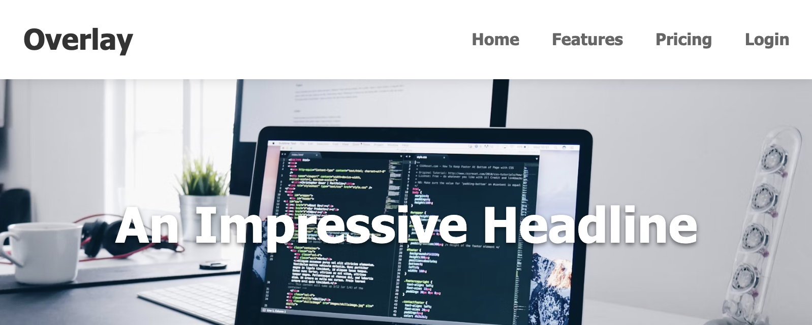
"Change on Scroll" Sticky Navbar Template
This effect is popular in modern design for creating an elegant, immersive entry to a webpage. The navbar begins transparently over a hero section and transitions to a solid, functional bar as the user scrolls into the main content.

The "Change on Scroll" Sticky Navbar
An elegant and modern navbar that starts transparent over a hero image and seamlessly transforms into a solid, opaque bar with a shadow as the user scrolls down the page. This provides a clean, impressive look for landing pages while ensuring navigation remains legible and accessible over regular content.
- Transparent to Solid Transition — JavaScript detects the scroll position. When the user scrolls past the hero section, a class is added to the navbar, triggering smooth CSS transitions for background color, text color, and box-shadow.
- Fixed Positioning — Uses
position: fixedto remain at the top of the viewport at all times, which is ideal for an overlay effect on a hero section. - High Readability: In its initial transparent state, text is white with a subtle shadow to ensure it's readable over a variety of hero images. In its solid state, text becomes dark for high contrast.
- Smooth Animations: All state changes are animated with the CSS
transitionproperty for a polished, professional feel. - Fully Responsive: The effect and layout work perfectly on all screen sizes, collapsing into a standard hamburger menu on mobile.
Coding Best Practices
- CSS custom properties (variables) are used for easy theme customization (colors, fonts).
- The code is appropriately commented to explain the purpose of each section.
- A tiny, efficient JavaScript snippet is used for the mobile menu toggle, as it is the most accessible and modern method (arguably superior to the older "checkbox hack").
Code
Here's the full code for the navbar template: