Full-Screen Overlay Navbar Template
Try this full-screen overlay navbar. Perfect for creative portfolios, agencies, and sites that want to make a statement. Copy and paste the code straight into your own web projects.
This is a bold, modern navigation pattern often used on portfolio and design-focused websites to create a dramatic and immersive experience. It prioritizes a clean initial view and presents navigation in a memorable, high-impact way.
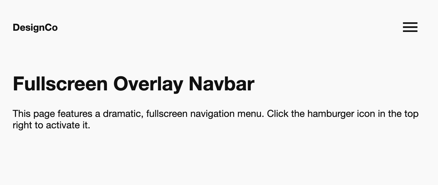
The Fullscreen Overlay Navbar
A dramatic and stylish navigation pattern that dedicates the entire screen to the menu. When the user clicks the menu icon, the page is covered by a bold overlay, and navigation links animate into view. This design-forward approach is perfect for creative portfolios, agencies, and sites that want to make a statement.
- Key Feature: Immersive Fullscreen Overlay — The menu takes over the entire viewport with a solid background, focusing the user completely on navigation.
- Key Feature: Staggered Link Animation — Navigation links don't just appear; they smoothly slide in one by one from the bottom, creating a sophisticated and fluid animation effect.
- Key Feature: Critical Accessibility (Focus Trapping & Body Lock) — When open, the overlay traps keyboard focus so users can't tab to background content. Body scrolling is also locked. The menu is fully keyboard and screen-reader accessible.
- Performant & Modern: Built using performant CSS transitions and transforms. JavaScript is used to manage state and ensure a high level of accessibility.
Coding Best Practices
- CSS custom properties (variables) are used for easy theme customization (colors, fonts).
- The code is appropriately commented to explain the purpose of each section.
- A tiny, efficient JavaScript snippet is used for the mobile menu toggle, as it is the most accessible and modern method (arguably superior to the older "checkbox hack").
Code
Here's the full code for the navbar template: