Split Navbar Template
A classic and versatile navbar layout that cleanly separates primary navigation from secondary user actions.
This is a widely used, and highly effective layout that naturally organizes different types of navigation actions. This implementation uses a modern Flexbox approach for robust alignment.
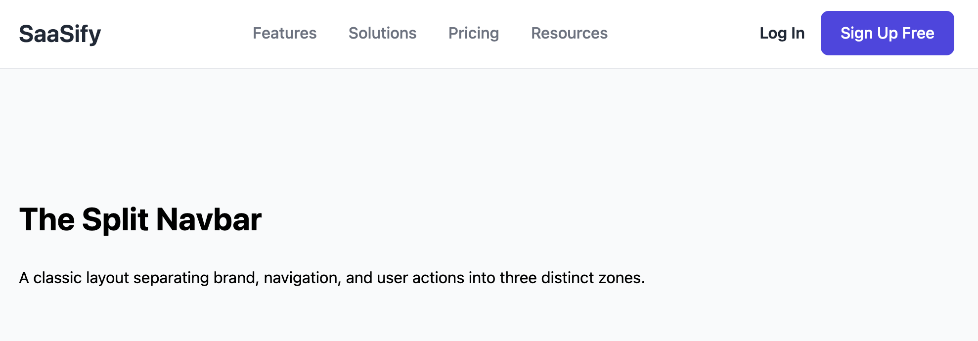
The Split Navbar
A classic and versatile navbar layout that cleanly separates primary navigation from secondary user actions. The brand logo is positioned on the far left, the main page links are grouped in the middle, and user-centric actions like "Login" and "Sign Up" are on the far right. This is a very common and user-friendly pattern for web applications and corporate websites.
- Three-Zone Layout — This navbar uses CSS Flexbox with
justify-content: space-betweento create three distinct zones, providing a strong visual separation between the brand, main navigation, and user actions. - Clear Visual Hierarchy — The most important user action, "Sign Up," is styled as a prominent Call-to-Action (CTA) button to draw the eye, while the secondary "Login" link is more subtle.
- Fully Responsive: On smaller screens, the layout gracefully collapses into a familiar mobile pattern, with the logo on the left and a hamburger menu icon on the right, which toggles all navigation links in a clean, vertical list.
- Easy to Customize: The code is built with clean CSS variables and semantic HTML, making it easy to adapt the colors, fonts, and spacing to fit any brand.
Coding Best Practices
- CSS custom properties (variables) are used for easy theme customization (colors, fonts).
- The code is appropriately commented to explain the purpose of each section.
- A tiny, efficient JavaScript snippet is used for the mobile menu toggle, as it is the most accessible and modern method (arguably superior to the older "checkbox hack").
Code
Here's the full code for the navbar template: