Classic Sticky Navbar Template
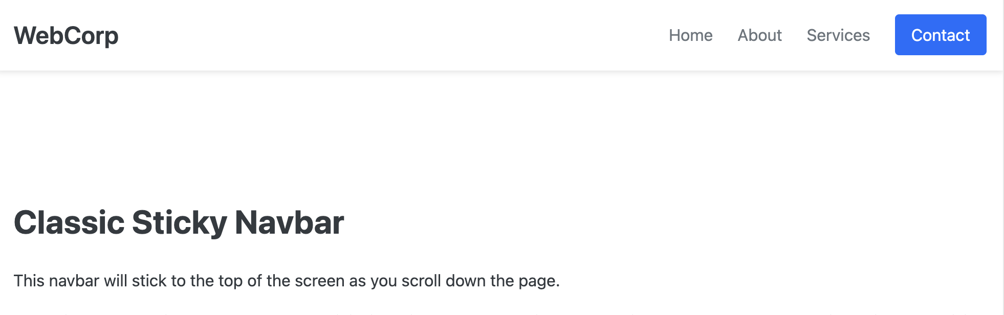
This navbar uses that classic sticky effect, where it sticks to the top of the screen when the user scrolls. It's a clean, no-frills, professional component that's easy to integrate into almost any project.
The Classic Sticky Navbar
This is the quintessential sticky navbar, a fundamental component for modern websites. It remains fixed to the top of the viewport as the user scrolls, keeping navigation controls accessible at all times without requiring any complex JavaScript.
- Core Sticky Functionality — Achieved using a single, powerful CSS property:
position: sticky. This is the modern, performant way to create sticky headers without the layout complexities ofposition: fixed. - Subtle Drop Shadow — A soft drop shadow appears below the navbar, visually "lifting" it off the content below. This adds depth and clearly separates the navigation from the rest of the page.
- Clean and Timeless Layout: Features a standard, professional layout with the brand logo on the left, navigation links in the center, and a distinct call-to-action button on the right.
- Fully Responsive: The navbar gracefully collapses into an accessible, toggle-able hamburger menu on smaller screens, ensuring a great user experience on all devices.
- Simple and Easy to Integrate: With minimal code and clean CSS variables, this component is incredibly easy to customize and drop into any project.
Coding Best Practices
- CSS custom properties (variables) are used for easy theme customization (colors, fonts).
- The code is heavily commented to explain the purpose of each section.
- A tiny, efficient JavaScript snippet is used for the mobile menu toggle, as it is the most accessible and modern method (arguably superior to the older "checkbox hack").
Code
Here's the full code for the navbar template: