Horizontally Scrollable Table Template
Make any wide table responsive with the simplest and most reliable method: horizontal scrolling.
By wrapping your table in a container with an overflow property, you can ensure your data is always accessible on mobile devices without breaking your page layout.
About this Responsive Table Method
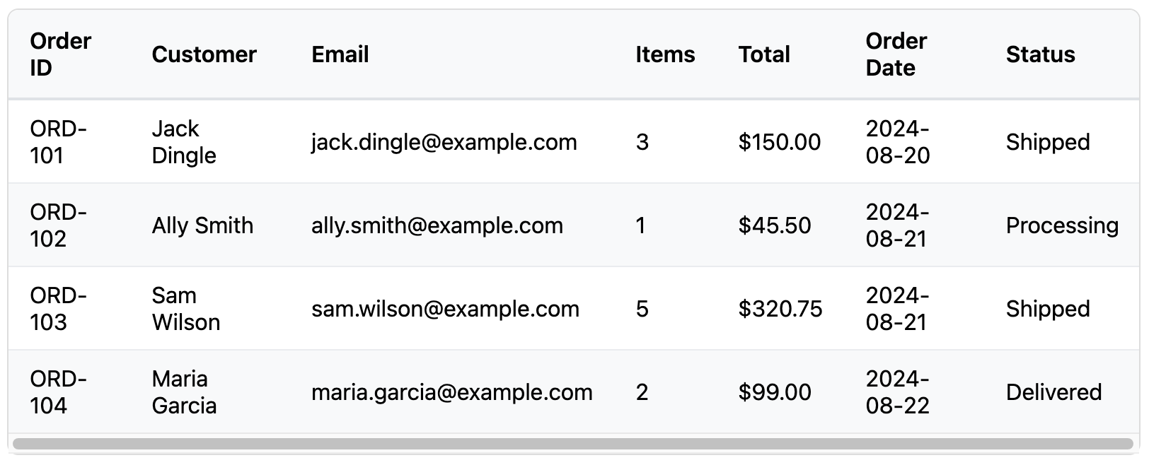
Tables, by their nature, are wide. When a wide table is viewed on a narrow screen, it will often "break" the page layout by overflowing its container and forcing the entire page to scroll horizontally. This is a poor user experience.
This template solves the problem elegantly. The technique involves two parts:
- The
tableitself is allowed to be as wide as it needs to be. - It is placed inside a wrapper
div. This wrapper is given the CSS propertyoverflow-x: auto;.
The result is that on a wide screen, no change is visible. But on a screen narrower than the table, the table content itself becomes scrollable, while the rest of the page remains fixed. It's a robust, cross-browser solution that preserves the table's structure for all users.
Key Features:
- Simple and Robust: The most straightforward way to handle responsive tables.
- Preserves Layout: Keeps the table's intended grid structure intact, which is often best for comparing data.
- No Complex CSS or JS: Relies on a single, well-supported CSS property.
- Excellent Accessibility: The table's structure is unchanged, so it remains perfectly accessible to screen readers and keyboard users.
Ideal Use Cases:
- Large datasets with many columns that need to be compared side-by-side.
- Admin dashboards and data-heavy applications.
- When more complex responsive solutions (like stacking) are not desired or would confuse the data's meaning.
Code
Here's the full code for the horizontally scrollable table: