Stacked Rows on Mobile Table Template
Avoid horizontal scrolling on mobile with this responsive table that cleverly stacks rows into a vertical card layout on small screens.
This pattern provides a significantly better user experience on phones for data-rich tables, presenting information in an easy-to-read, organized format.
About this Responsive Table
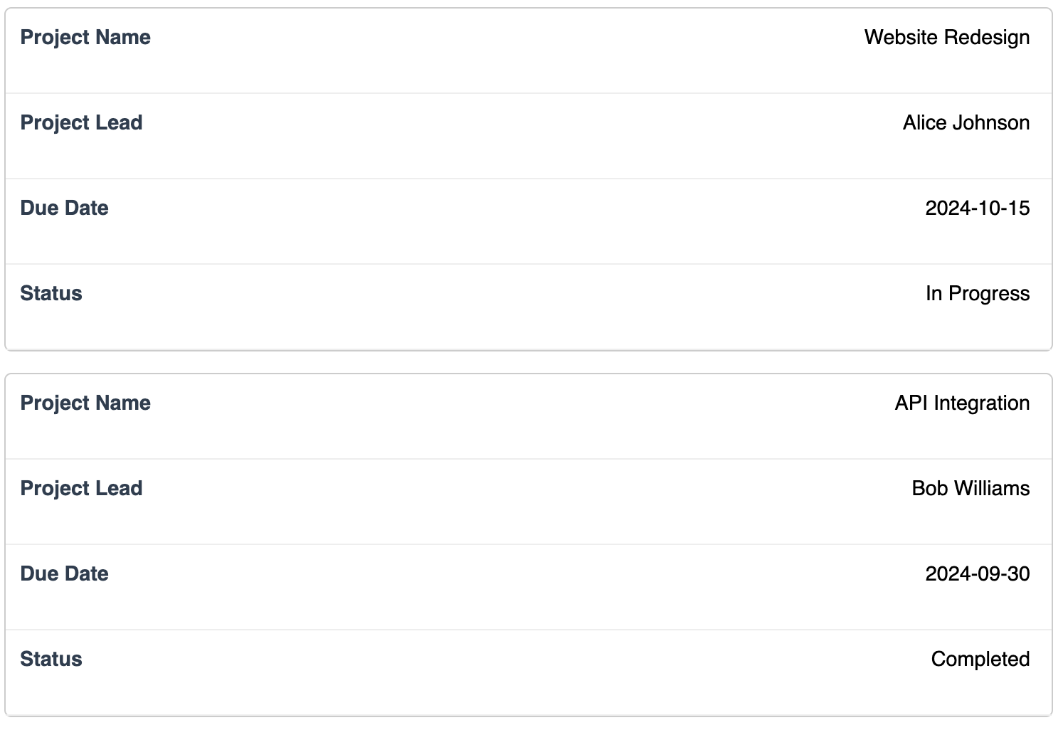
On a desktop or large screen, this template appears as a standard, conventional table. However, when viewed on a smaller screen (like a mobile phone), a CSS media query triggers a transformation. The table's rows convert into individual block-level "cards," and the column headers are used as labels for each piece of data. This is achieved using HTML data attributes and CSS pseudo-elements, removing the need for horizontal scrolling.
Key Features:
- Superior Mobile Experience: Eliminates awkward horizontal scrolling for tables with multiple columns.
- Card-like Mobile View: Data is presented vertically in a clean, scannable format on small screens.
- CSS-Only Solution: This responsive behavior is achieved entirely with HTML and CSS, requiring no JavaScript.
- Semantic Structure: The core markup is a semantic
table, ensuring it's still logical and accessible on larger screens.
Ideal Use Cases:
- Contact or user lists.
- Project status trackers.
- Order history summaries.
- Any table where each row represents a distinct "item" that can be viewed as a card.
Dependencies:
None. This template uses only pure HTML and CSS.
Accessibility & Implementation Notes:
To make this technique work, each td element in the HTML must have a data-label attribute that matches its corresponding column header. This label is then displayed using CSS on mobile.
Important: Modifying a table's display properties (e.g., to display: block;) can alter how screen readers interpret it on mobile. While visually superior, a screen reader may no longer announce the content as a data table with navigable rows and columns. This is a common trade-off with this design pattern.
Code
Here's the full code for the stacked table template: