Table with Sticky First Column Template
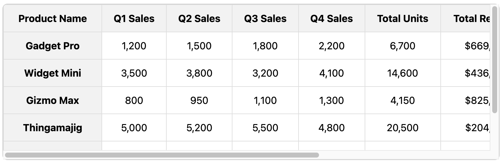
Keep row context in view on wide tables with this sticky first column effect.
Using position: sticky, this template freezes the first column, allowing users to scroll horizontally through many columns of data without ever losing track of which row they are on.
About this Sticky Column Table
This template is the perfect companion to a horizontally scrollable table. When dealing with wide datasets, it's easy for a user to scroll right and forget which item the data belongs to. By making the first column "sticky", you ensure the primary identifier for that row (like a name, ID, or product) is always visible.
This is achieved using the same modern CSS property as the sticky header: position: sticky. By applying this property along with left: 0; to the first th and td in each row, they will "stick" to the left edge of the scrolling container. A solid background color on these sticky cells is crucial to hide the other columns as they scroll underneath.
Key Features:
- Retains Row Context: The first column acts as a constant anchor, making wide tables much easier to understand.
- CSS-Only Solution: A modern, performant solution that doesn't require any JavaScript.
- Essential for Wide Data: A massive user experience improvement for tables with many columns.
Important Implementation Notes:
- Like the sticky header, this technique requires the table to be inside a container with
overflow-x: auto. - A
background-colormust be set on the sticky cells (boththandtd) so that other cells scroll "behind" them cleanly. - This template also makes the header sticky, showing how you can combine both effects for the ultimate responsive table. A higher
z-indexis given to the top-left corner cell to ensure it sits on top of both the header and the first column.
Dependencies:
None. Relies on modern browser support for position: sticky.
Code
Here's the full code for the sticky first column table: