Table with Sticky Header Template
Keep your table headers in view at all times with this handy sticky header effect.
Using the CSS position: sticky property, this template "sticks" the table header to the top of its container as you scroll down, ensuring you never lose context in long data tables.
About this Sticky Header Table
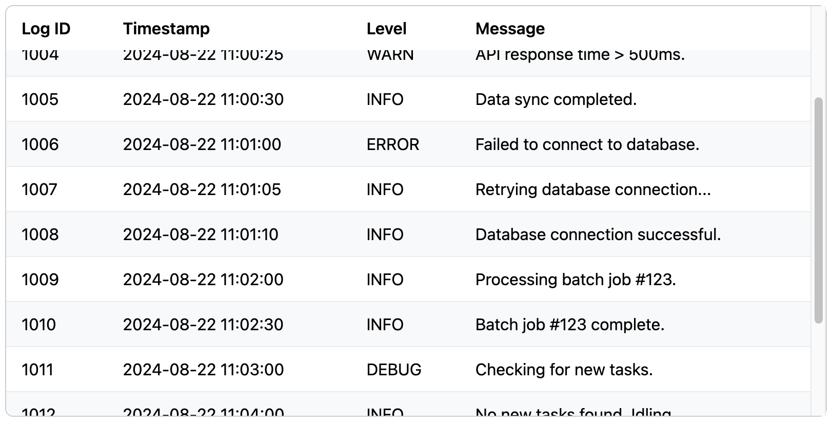
For long tables, losing the header row as you scroll down means losing the context for each column. The traditional solution required complex JavaScript, but modern CSS offers a much simpler and more performant way: position: sticky.
This technique works by applying position: sticky; and top: 0; to the header (th) elements. For this to take effect, the table must be inside a container that has a defined height and is set to overflow. As you scroll within that container, the browser ensures the sticky elements remain fixed at the top of the viewport. This provides an excellent user experience for large datasets.
Key Features:
- Improves Context: Column headers are always visible, so users don't have to scroll back up to understand the data.
- CSS-Only Solution: No JavaScript is needed, making it lightweight, fast, and reliable.
- Great User Experience: A significant improvement for any table with more rows than can fit on the screen.
Important Implementation Notes:
- The table must be wrapped in a container with a defined
heightand anoverflowproperty (likeoverflow-y: auto). The header sticks relative to this scrollable container. position: stickyneeds a directional property liketop,left, etc., to know where to stick. For a top header,top: 0;is used.- Sticky positioning may not work if any parent element has its own
overflowproperty set tohidden,scroll, orauto, as this can interfere with the browser's calculations.
Dependencies:
None. This template uses only pure CSS and HTML, but it relies on modern browser support for position: sticky.
Code
Here's the full code for the sticky header table: