Column Hiding Responsive Table Template
Improve mobile readability by automatically hiding less-critical columns on smaller screens.
This responsive technique uses CSS media queries to create a "less is more" experience on mobile, ensuring the most important data is always visible without horizontal scrolling.
About this "Column Hiding" Table
Sometimes, not all data is equally important. On a wide desktop screen, it's great to show extra details like "Date Created" or "Internal ID". On a narrow mobile screen, however, these details can often be sacrificed in favor of a clean, scroll-free view of the primary data.
This template achieves this using CSS Media Queries. We define special classes (e.g., .hide-on-mobile) and then, inside a media query that targets screens below a certain width, we set those classes to display: none;. This cleanly removes both the header (th) and all corresponding data cells (td) in that column, creating a more focused table view for mobile users.
Key Features:
- Prioritizes Primary Data: Ensures the most important columns are always visible.
- No Horizontal Scrolling: Provides a clean, vertical reading experience on mobile.
- CSS-Only Solution: Relies entirely on media queries and classes, with no JavaScript required.
- Easy to Configure: Simply add the specified class to any
thandtdelements you want to hide on smaller screens.
Ideal Use Cases:
- Admin tables where columns like "Last Updated" or "ID" are less critical on mobile.
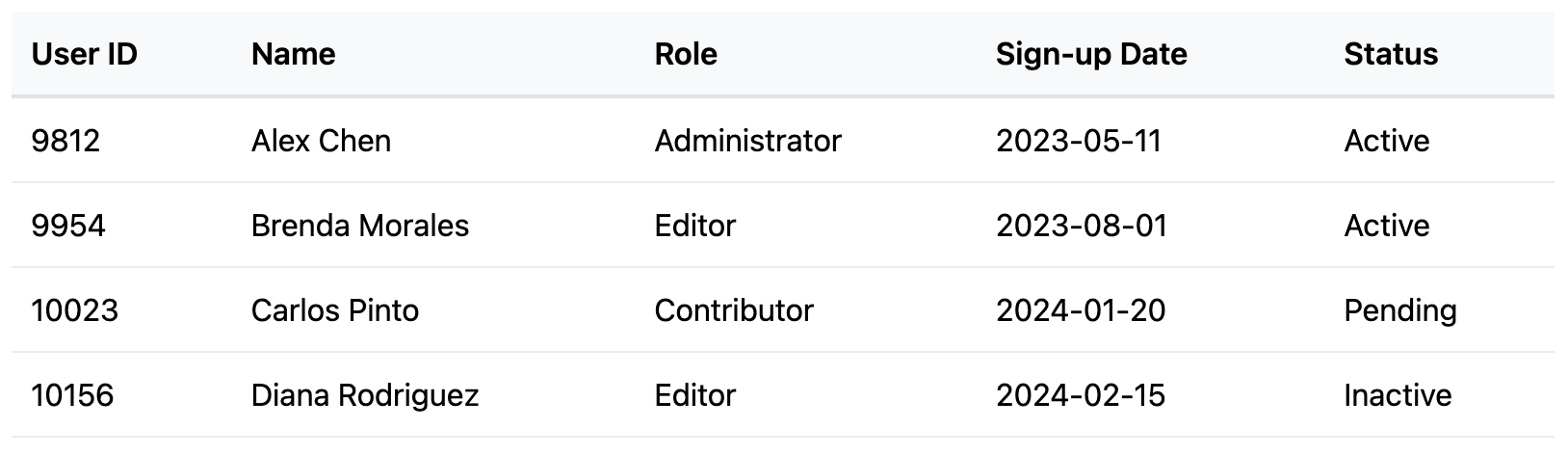
- User lists where "Sign Up Date" can be hidden to focus on fields like "Name", "Role", etc.
- Any table where there is a clear distinction between primary and secondary information.
Code
Here's the full code for the column-hiding table: