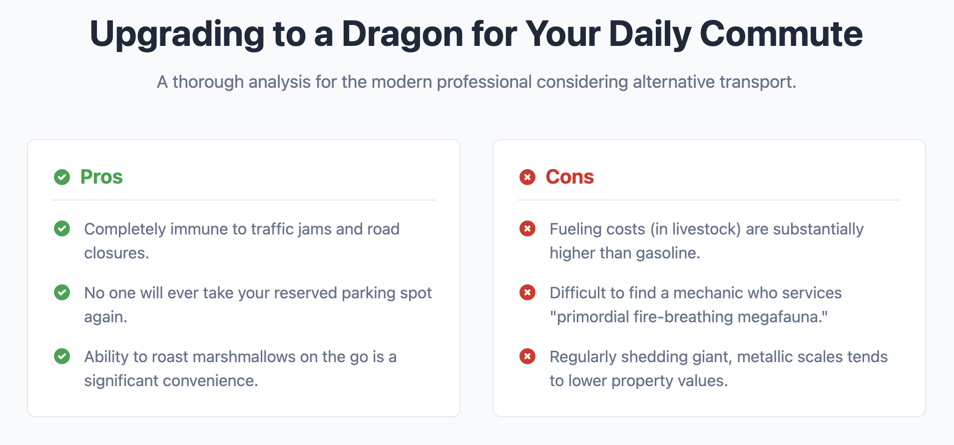
Pros and Cons List Template
Weigh the advantages and disadvantages of any topic with this clear, two-column comparison list.
This template is ideal for product reviews, decision-making articles, or any content where you need to present the opposing viewpoints for a single subject side-by-side.

About this Template
This component uses two distinct unordered lists, one for pros and one for cons, arranged within a responsive two-column grid. It provides clear visual cues, including color and accessible SVG icons, to differentiate between the positive and negative points. The entire template is self-contained and mobile-first, stacking the lists on small screens and placing them side-by-side on larger ones.
Features
- Semantic List Structure: Employs two separate
ulelements, which is a logical way to structure two distinct but related sets of points. - Clear Visual Differentiation: Uses icons and a defined color scheme to instantly communicate the nature of each list.
- Responsive CSS Grid Layout: A mobile-first layout that elegantly adapts from one to two columns based on screen size.
- Accessible Icons: The checkmark and cross SVG icons include a
titleelement for screen readers, ensuring their meaning is conveyed to all users. - Self-Contained Code: Styles are completely scoped to the
.pros-cons-templateclass to prevent any conflicts with your project's styles.
Code Breakdown
The main container, with a class of .pros-cons-container, is a CSS Grid element. A media query changes this from a single-column to a two-column layout on screens wider than 768px.
Inside the container are two div elements: one for the pros and one for the cons. Each of these contains a heading and a semantic ul. The list items use Flexbox to align the icon with the text. The icons are inline SVGs, which can be easily styled with CSS, including their color via the fill property.
Code
Here's the full code for the template: