Card-Based List Template
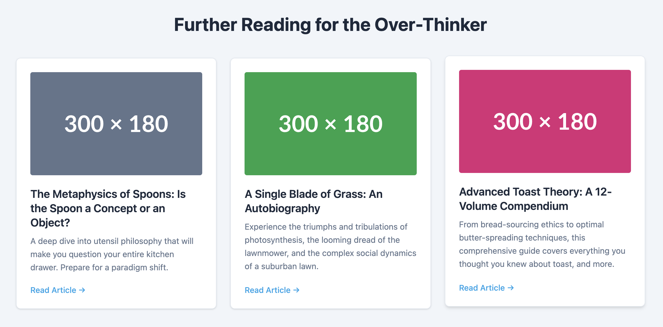
A modern and stylish list where each item is presented as its own self-contained card.
This template uses a responsive grid to arrange cards, making it perfect for blog indexes, product galleries, or feature showcases.

About this Template
This component arranges list items into a clean grid of cards. It is built on a semantic unordered list (ul) but styles each list item (li) to look like a card with its own background, padding, and shadow. The layout uses CSS Grid's powerful auto-fit property to create a responsive grid that automatically adjusts the number of columns based on the available screen space.
Features
- Fully Responsive Grid: The grid layout requires no manual media queries to adapt to different screen sizes.
- Semantic Structure: Based on a standard
ul, which is appropriate for a collection of items. - Self-Contained Code: All styles are scoped to the
.card-list-templateclass to prevent unwanted side effects. - Modern Card Design: Includes properties like
border-radiusandbox-shadowfor a clean, modern aesthetic. - Hover Effect: A subtle lifting effect on hover gives users satisfying visual feedback.
Code Breakdown
The component starts with a div that contains an unordered list, ul, with the class .card-list. We apply display: grid to this list.
The core of the responsive layout comes from this rule on the list: grid-template-columns: repeat(auto-fit, minmax(280px, 1fr)). This single line tells the browser to create as many columns as can fit, where each column has a minimum width of 280px but can expand to fill any available space. Each li is then styled to become a "card", with padding, a background color, and a box shadow.
Code
Here's the full code for the template: