Hover-Effect List Template
An interactive list where items react to the user's mouse with smooth CSS animations.
This template is ideal for making lists of links or actions feel more responsive and engaging by providing satisfying visual feedback on hover.
About this Template
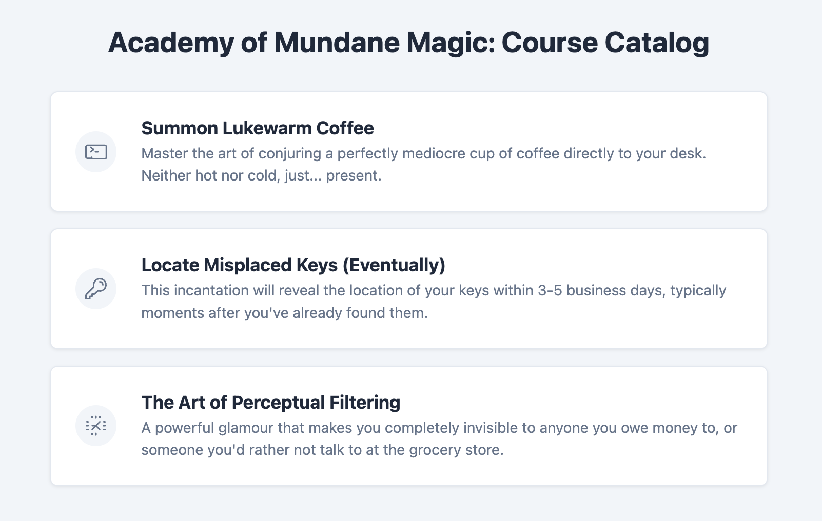
This component demonstrates how to create a simple yet elegant hover effect using only CSS. Each list item is a clickable link styled as a card. When a user hovers their mouse over an item, it smoothly lifts up and its colors change. This effect is achieved with the CSS :hover pseudo-class in combination with the transition property, which animates the changes.
Features
- Pure CSS Interactivity: The entire hover effect is achieved without any JavaScript.
- Smooth Transitions: Uses the
transitionproperty for a polished, professional animation instead of an abrupt change. - Semantic List Structure: Built upon a standard
ulof links, which is a highly common and appropriate pattern. - Self-Contained: All CSS is scoped to the
.hover-effect-list-templateparent class to avoid conflicts. - Easy Theming: Animation speed, colors, and shadows can be quickly adjusted with CSS variables.
Code Breakdown
Each list item contains a single anchor tag (a) with the class .list-item. On this base class, we define its default state including background color and shadow. We also use the transition property for a smooth animation. This property tells the browser which CSS properties should animate and how long the animation should take.
We then define a .list-item:hover rule. This CSS block contains the styles for the "hover" state. For this example, we change the transform property to lift the card and the box-shadow to make it more prominent. Because the base item has a transition property defined, the browser will automatically create a smooth animation between the default state and the hover state.
Code
Here's the full code for the template: