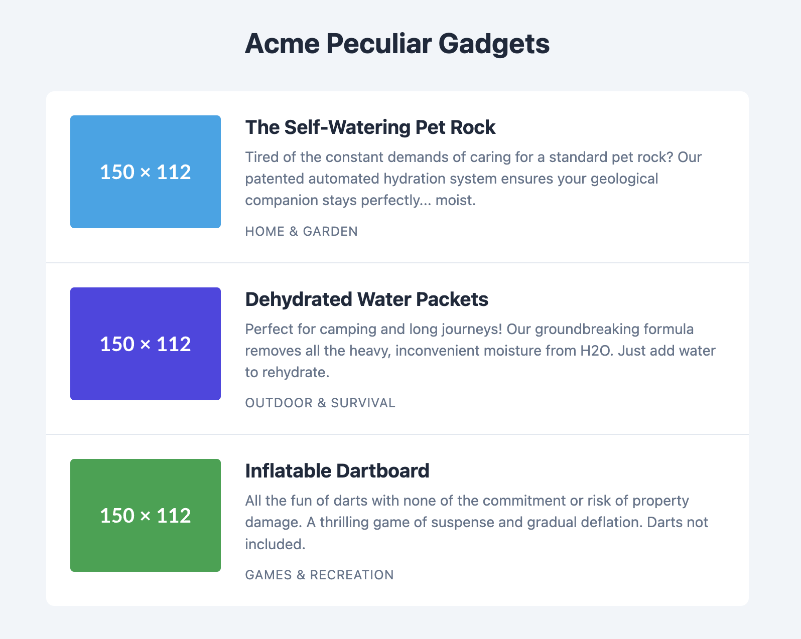
Image Thumbnail List Template
A versatile list for showcasing items that have an associated image, like articles or products.
This template aligns a thumbnail image with a title, a short description, and other metadata in a clean, row-based format.

About this Template
This component, often called a "media object", is a fundamental design pattern for the web. This implementation uses a semantic ul, where each list item is an article containing an image and its corresponding text. The layout is managed with Flexbox, ensuring the thumbnail and text content align properly and responsively. The entire code is self-contained for easy integration.
Features
- Semantic Markup: Uses an unordered list of articles, which is a semantically sound structure for a list of self-contained items like blog posts or products.
- Robust Flexbox Layout: Ensures the image and text columns are perfectly aligned and adapt gracefully to different content heights.
- Easy Placeholder Images: Uses an external placeholder service to demonstrate image placement, making it easy for you to replace with your own images.
- Subtle Hover Effect: A gentle hover effect provides users with visual feedback.
- Self-Contained: All CSS is scoped to the
.thumbnail-list-templateclass to avoid conflicts.
Code Breakdown
The core structure is a ul element with the class .thumbnail-list. The default list styling is removed.
Each list item has an a tag as its immediate child, making the entire card clickable. This anchor tag has a class of .thumbnail-item and is a flex container with display: flex applied. This places its two children, a figure for the image and a div for the text, side-by-side. The image is set to have a fixed width, and the text container grows to fill the remaining space.
Code
Here's the full code for the template: