Multi-Column List Template
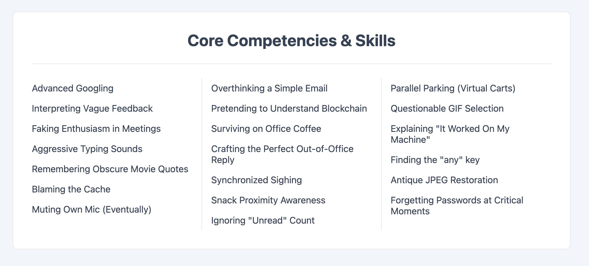
An efficient layout that automatically breaks a single long list into multiple columns.
This template is perfect for sitemaps, indexes, or any extensive list of links that would otherwise require excessive scrolling.
About this Template
This component uses the native CSS multi-column layout module to reformat a standard unordered list. With just a few lines of CSS, a long, single-column list is automatically distributed into a responsive, multi-column format. It is a highly efficient way to present long lists of data in a compact and user-friendly way, and it requires no complex markup or JavaScript.
Features
- Efficient CSS Columns: Uses the
column-countproperty to achieve the layout. - Simple Semantic HTML: The layout is applied to a standard
ul, maintaining a clean and simple document structure. - Responsive by Design: Media queries are used to adjust the number of columns based on the viewport width.
- Unbreakable List Items: Uses the
break-inside: avoid;rule to prevent list items from splitting unattractively across columns. - Self-Contained Code: All styles are scoped to the
.multi-column-templateparent class to prevent style conflicts.
Code Breakdown
The entire structure consists of a single unordered list (ul) with the class .multi-column-list. All the work is done by the CSS.
On the .multi-column-list class, we initially set column-count: 1 for the mobile-first approach. We also define a column-gap for spacing and an optional column-rule to draw a line between columns. Inside media queries, we simply change the value of column-count to 2 or 3 for larger screens, and the browser handles the rest, automatically distributing the list items.
Code
Here's the full code for the template: