Pricing Plan List Template
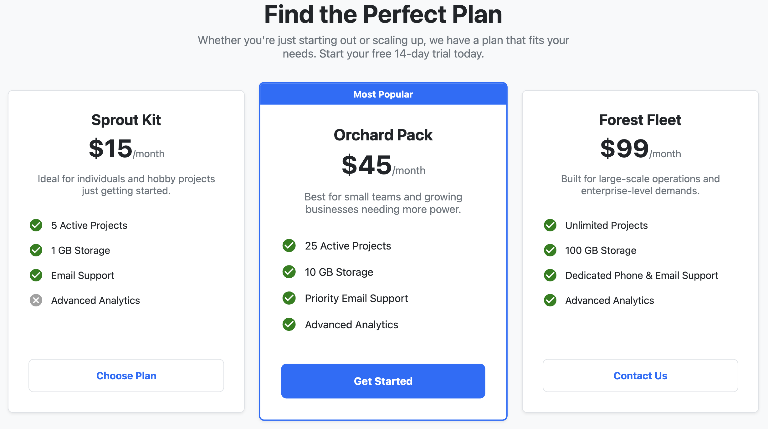
A responsive template for creating clear and effective pricing comparison tables.
This component is perfect for SaaS products, service agencies, or any website that needs to display different tiers of features and costs in an easy to read format.
About this Template
This pricing plan list provides a clean and modern design to compare different subscription levels or product packages. It uses Flexbox to create a layout that is a single column on mobile devices and expands to multiple columns on larger screens. The template features a visually distinct "recommended" plan to help guide customer decisions.
Features
- Self-Contained Code: All styles are scoped to a parent class, preventing conflicts with your existing website's CSS. Just copy and paste the code into your project.
- Mobile-First Design: The layout fluidly adapts from a single vertical column to a multi-column horizontal layout.
- Highlighted Plan: The middle plan includes a
.recommendedclass and a banner to make it stand out. - Easy Customization: Key design elements like colors and fonts can be changed easily by editing the CSS custom properties at the top of the style block.
- Semantic HTML: The structure uses
article,h2, andultags to organize content logically for SEO and accessibility. - Accessible Icons: Self-contained SVG icons are used for checkmarks and crosses. They remain sharp at any size and include a
titleelement for screen readers.
Code Breakdown
The entire component is wrapped in a div with a .pricing-plan-template class. All CSS is scoped to this class. This ensures that the component's styles will not accidentally affect other elements on your page. Inside this, a container with the .pricing-grid class uses display: flex and flex-wrap: wrap to manage the layout of the individual pricing plans. Each plan is an article element with the class .plan.
Accessibility Notes
Accessibility was a key consideration for this template. Each pricing plan is structured as a self-contained article with a clear heading. This makes the page structure understandable to assistive technologies. For the highlighted plan, a visually hidden span with the text "Recommended" is included. This ensures that users who cannot see the visual emphasis still get the same information. The SVG icons for features also have a descriptive title so that their meaning is clear to everyone.
Code
Here's the full code for the template: