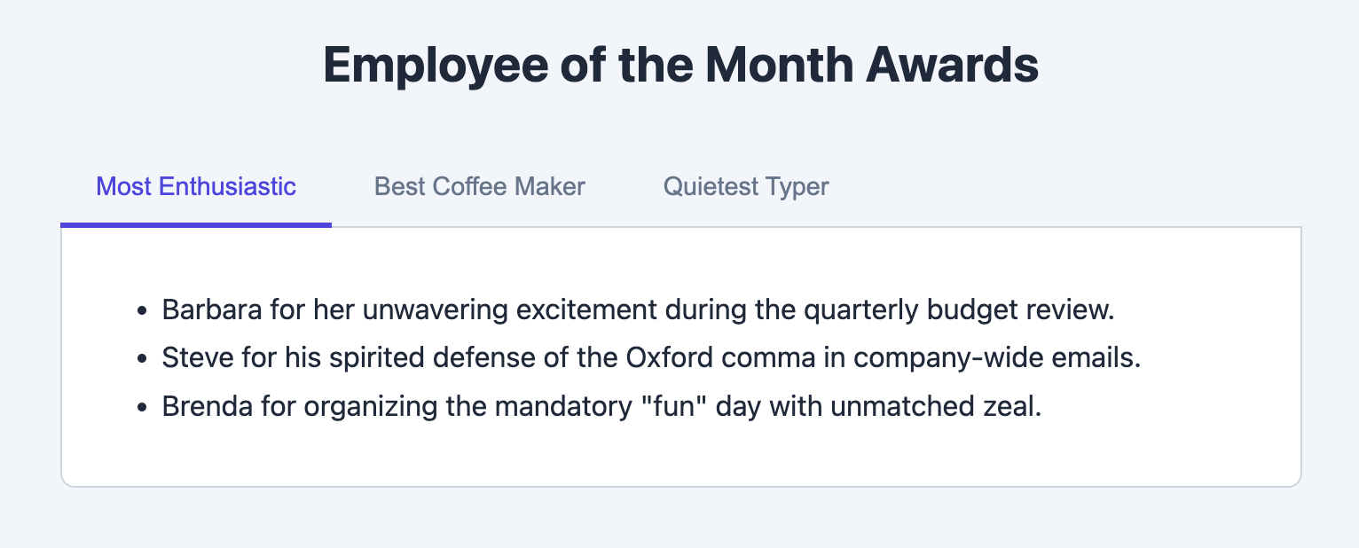
Tabbed List Template
An accessible tabbed interface that lets users switch between different lists of content.
This is a highly effective pattern for organizing categorized content, such as different types of services, product features, or pricing plans, without cluttering the page.

About this Template
This component provides a fully accessible tabbed interface, following WAI-ARIA best practices. The structure consists of a list of tab buttons that control the visibility of corresponding content panels. The state of the tabs (e.g., which one is currently selected) is managed with JavaScript, which updates the appropriate ARIA attributes and CSS classes.
Features
- Fully Accessible: Uses correct ARIA roles (
tablist,tab,tabpanel) and states (aria-selected,aria-controls) to ensure it is usable with screen readers and other assistive technologies. - Keyboard Navigation: Supports arrow key navigation between tabs as per accessibility guidelines.
- Pure JavaScript Logic: The tab switching functionality is self-contained and dependency-free.
- Clean, Modern Styling: Features a simple and clean design with clear visual indication for the active tab.
- Self-Contained: The component is fully scoped and ready to drop into any project.
Code Breakdown
The component is wrapped in a main div. The tabs themselves are in a div with role="tablist", and each tab is a button with role="tab". Each tab button has an aria-controls attribute that points to the id of the content panel it controls.
The content panels are located in a separate container. Each panel is a div with role="tabpanel". By default, all but the first panel are hidden.
The JavaScript adds a click event listener to the tablist. When a tab is clicked, the script first deactivates all other tabs and hides all other panels. Then, it activates the clicked tab (by setting aria-selected="true" and an active class) and shows the corresponding panel by finding it via the tab's aria-controls attribute.
Code
Here's the full code for the template: