Grid Item Placement
Understanding how grid items are placed into the grid is crucial when working with CSS grid layout.
If you don't fully understand how grid items are placed into the grid, you could end up wasting a lot of time trying to do something that should only take a few seconds.
Fortunately, it's not a hard concept to grasp. Basically, it all comes down to the grid lines.
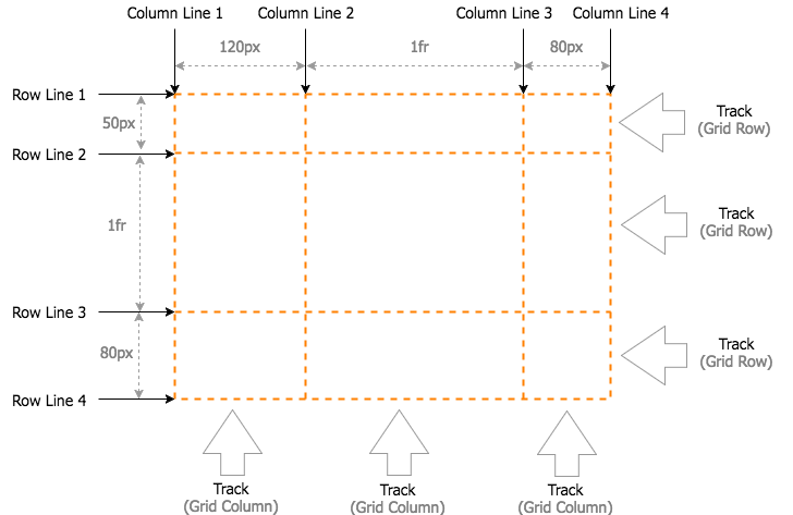
Grid lines are the horizontal and vertical dividing lines of the grid. Each row and column has a grid line on either side of it (these can also be referred to as row lines and column lines). Each grid line has a numerical index that you can refer to when placing a grid item.
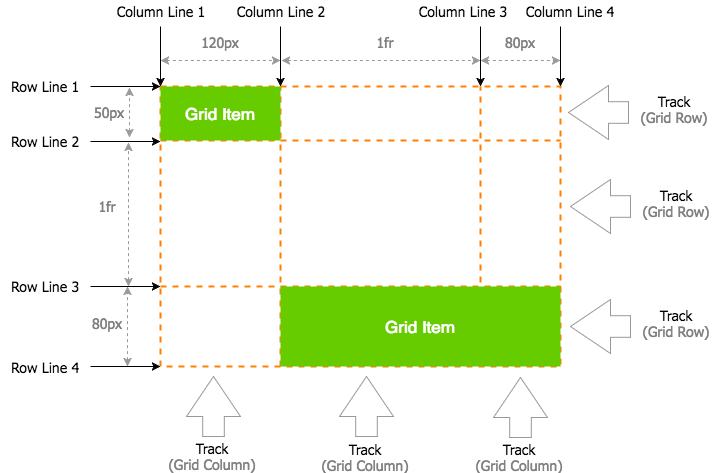
In the above example, the first grid item starts at row line 1 and column line 1. It ends at row line 2 and column line 2. The second grid item starts at row line 3 and column line 2. It ends at row line 4 and column line 4.
This can be done with the following code:
Here's a working example:
In this case, we didn't really need to specify the end values on the first grid item, because it only spans 1 track anyway. The same could be said for the second item's end row line. By default, if you don't specify an end line, it will only span 1 track.
Actually, we didn't need to specify any positioning for the first grid item, as it's in the precise position it would've been in anyway. But if we hadn't done any positioning on the second item, it would've been sitting next to item 1 on the first row, only spanning 1 track.
Named Grid Lines
You can also create your own name for these grid lines for easier reference. You can name them with the grid-template-rows and grid-template-columns properties. Like this:
Named lines can be either explicit or implicit. Implicit named lines are created whenever you create named grid areas using the grid-template-areas property. The name is taken from the grid area, with either -start or -end appended (depending on whether it's the start line or end).
So for each named grid area named header, four implicit named lines are created. Two named header-start name the row-start and column-start lines of the named grid area, and two named header-end name the row-end and column-end lines of the named grid area.
Named Grid Areas
A grid area can be named explicitly using the grid-template-areas property of the grid container. This is what we did previously, when we created a website layout.
To recap, it goes something like this:
You can specify an empty cell by using a full stop (.) or series of full stops with no space in between.
For example:
Or:
The Grid Placement Properties
There are three shorthand properties that can be used instead of the longhand grid placement properties covered in the above examples. Here's where they all fit in.
grid-area-
This property is shorthand for the following properties:
grid-column-
This property is shorthand for the following properties:
grid-column-start- Specifies which column line a grid item starts on, and how many tracks it spans.
grid-column-end- Specifies which column line a grid item ends on, and how many tracks it spans.
grid-row-
This property is shorthand for the following properties:
grid-row-start- Specifies which row line a grid item starts on, and how many tracks it spans.
grid-row-end- Specifies which row line a grid item ends on, and how many tracks it spans.
You can also use the grid-auto-flow property that I mentioned when discussing the explicit vs implicit grid. This specifies how auto-placed grid items should be placed on the grid. Auto-placed items are those that aren't explicitly placed using any of the above placement properties.