Introduction to CSS Grid Layout
CSS grid layout is a new layout model optimized for two-dimensional layouts. It's ideal for website layouts, forms, image galleries, and anything that requires precise and responsive positioning.
CSS includes many properties that can help with a website's layout. But until early 2017, there was no mechanism in CSS for creating two-dimensional website layouts. But all that has changed with the introduction of CSS grid layout.
The CSS Grid Layout Module was developed by the CSS Working Group to provide a better way to create website layouts in CSS. It became a Candidate Recommendation in February 2017, and major browsers started to support grid layout in March 2017.
With CSS grid layout (or just "CSS grid"), creating advanced, (and responsive) layouts is now extremely straightforward. CSS grid will almost certainly change the way we develop websites.
Why CSS Grid?
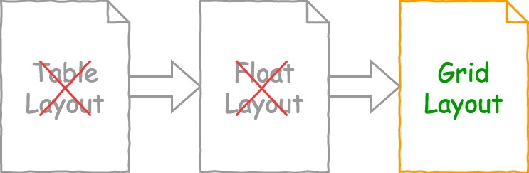
As the web evolved over the years, building website layouts became more and more challenging. In the early days of the web, HTML tables were often used for multi-column layouts, forms, etc. But this method had its issues. It meant that the presentation had to be done at the markup level, so there was no separation between presentation and content. Tables were designed to hold tabular data, not for doing layouts. And apart from causing semantical issues, table layouts are not suited to responsive design.
Floated elements eventually replaced table layouts as the commonly accepted and recommended layout method, as it allows us to position elements independently of the markup. However, while this method was a vast improvement from the table based layouts, it also had its limitations. Floats were mainly designed for document layout, and they weren't necessarily ideal for the more complex, application layout that is so prevalent on the web today. Floated elements can be difficult to control, especially when viewed on different sized devices and viewports. This resulted in various grid-like "hacks" becoming the norm, most of which required extra markup, which detracts from the whole concept of content separation. And so the CSS Working Group sought a better solution.
The CSS grid layout model addresses these issues and more. It allows you to create advanced layouts in a fraction of the time it would take to do it with floated elements, and with less code.
While it's true that the introduction of flexbox had already allowed developers to start moving away from floated elements, flexbox only works in one-dimension. Grid works in two-dimensions, so it is much better suited for creating complex layouts.
How Grid Works
Grid layout works on a grid system. The grid is an intersecting set of horizontal and vertical lines which create a sizing and positioning coordinate system for the grid container's contents.
To create a grid, you simply set an element to display: grid. This automatically makes all of that element's direct descendents grid items. You can now use the various grid properties to adjust their size and positioning as required. Usually the first step is to define how many rows and columns the grid has (but even that's optional — as you'll see later).
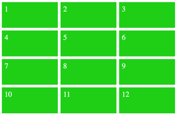
This is an example of a grid with four rows and three columns. It contains 12 grid items. Each grid item is green, and there's a gutter in between them (the gutter defines the space between each grid item).
These grid items are all the size of a single cell but they could be any size we wish. We could make them all different sizes if we wanted. Some could span multiple columns or rows, others could remain the size of a single cell. The rest of this tutorial demonstrates these and other grid features.