Create a Website Layout with CSS Grid
Here we use CSS grid layout's "ASCII art" syntax to generate a three-column website layout.
Grid includes an intuitive "ASCII art" syntax where you can virtually "see" the layout within your code, so this makes it extremely easy to create and modify to your layout. Even major changes can be done within a few seconds. This intuitive syntax also helps with responsive web design. Creating different layouts for different devices becomes quite trivial when using grid.
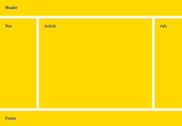
Now we'll create a website layout that looks like this:
Here's the code:
Let's take a closer look at that code.
The HTML markup looks like this:
We'll be making the body element the grid container, so all other elements will become grid items.
So let's look at that ASCII art I was talking about:
This is the bit that defines the actual layout. Just by looking at the code, we can see that it's a 3x3 grid (three rows and three columns). So there are five grid areas across nine grid cells (some grid areas take up multiple cells).
We can also see that the header takes up all of the first row (three cells), and the footer takes up all of the bottom row (three cells). The nav, article, and ads sections all share the second row (one cell each).
Now we can assign each of these grid areas to an element:
The grid-area property is a shorthand property that allows you to place grid items within a grid. In this case, we simply refer to the names that we previously provided to the grid-template-areas property.
Most of the layout is now finished. The remainder of the code simply deals with sizing, gutters, heights, etc.
In particular, the following code sets the size of the rows and columns:
The first and third rows are both 60 pixels high, and the second row takes up the remaining space.
The first column is 20 percent and the third column is 15 percent (relative to the inline size of the grid container). The second column takes up the remaining space.
See grid-template-rows and grid-template-columns for more information on track sizing.
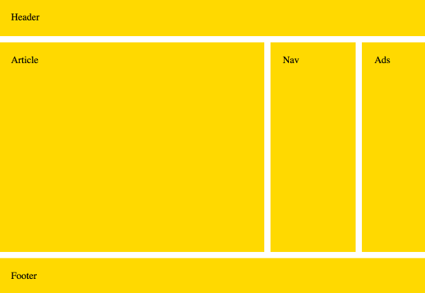
Modifying the Layout
You can change the layout by simply rearranging the grid areas provided to the grid-template-areas property.
So if we change it to this:
We end up with this:
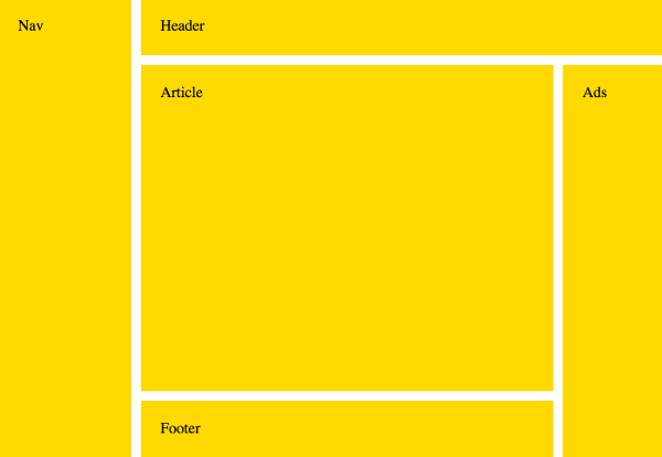
However, you may need to adjust the track sizing if you move a smaller grid item into a larger space.
For example, to do this:
The Nav now takes up the space where Article was, therefore the track sizing has had to be adjusted. Otherwise we'd have a narrow article and a really wide nav bar.
So the code now looks like this: