Explicit vs Implicit Grid
This article explains the difference between explicit and implicit grids in CSS grid layout.
CSS grid layout uses the concept of an explicit grid and an implicit grid. This is a key concept that you need to be aware of when creating a grid, otherwise you could end up with a bunch of rows or columns that you didn't expect!
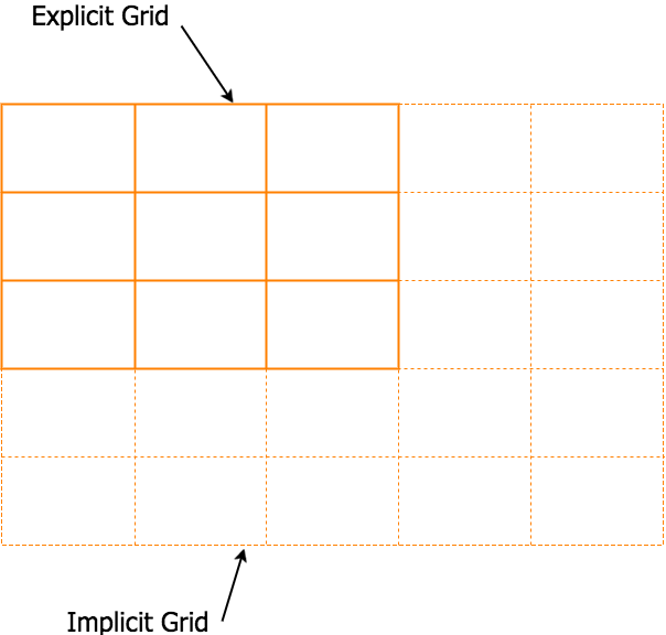
The explicit grid is the grid that you define with the grid-template-rows, grid-template-columns, and grid-template-areas properties.
However, you can still have elements that don't fit into your explicitly defined grid. For example, say you define a grid that can only fit 6 grid items, but the grid container actually contains 9 grid items. Only 6 items will fit into the explicit grid, and 3 will be left over. This is where the implicit grid comes in.
The implicit grid is automatically generated by the grid container whenever grid items are positioned outside of the explicit grid. The grid container generates implicit grid tracks by adding implicit grid lines to the grid. These lines together with the explicit grid form the implicit grid.
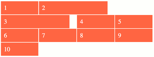
Here's an example:
In this example we explicitly define two rows and two columns. This will fit four grid items. However, there are six grid items, so an implicit grid has been created to accommodate the two extra items.
This is a good thing. If the implicit grid hadn't been created, the two extra items would probably make a complete mess of the grid.
Setting the Track Size on Implicit Grids
You may notice that the extra row is not as tall as its preceding two rows. This is because we set the row height using the grid-template-rows property, but this only applies to rows on the explicit grid. The row height on the implicit grid needs to be set with the grid-auto-rows property. But because we didn't do this, the implicit row uses a track size of auto (which is content based).
Here's how the track sizing properties fit in:
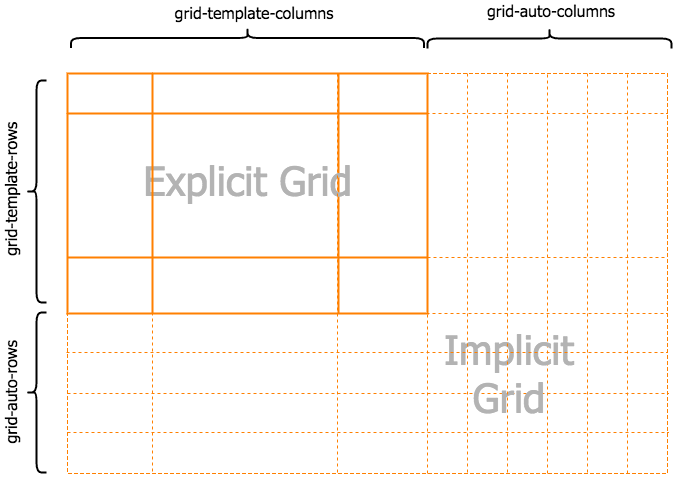
So it's like this:
- Explicit grid uses
grid-template-rowsandgrid-template-columns. - Implicit grid uses
grid-auto-rowsandgrid-auto-columns.
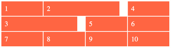
In the next example we make the explicit and implict rows all the same height (60px). So we add the grid-auto-rows property to set the height of the implicitly generated row:
Auto-flow across Rows vs Columns
So far, extra rows have been created to accommodate the extra grid items. But what if we want extra columns instead?
This can be done using the grid-auto-flow property.
This property allows you to specify whether to use rows or columns for auto-placed items. In other words, you can specify whether the implicit grid grows rows or columns. The initial value is row so this explains why the above example added more rows instead of columns.
If you prefer to use columns you can do this:
That will ensure that any extra items are placed into implicit columns instead of rows.
Here's what happens when we apply that to the first example:
Of course, you can go right ahead and use the grid-auto-columns property to change the width of the auto-generated column. So if you want all of the above columns to be the same width, you would use grid-auto-columns: 1fr.
The dense Keyword
The grid-auto-flow property also has an optional dense keyword that can help keep your grid compact and prevent lots of gaps due to inconsistently sized grid items.
For example, you can turn a grid like this:
dense keyword.
Into a grid like this:
dense keyword.
Using this keyword could result in items appearing out of order (because, later items can go back and fill in gaps that appeared earlier), so it's not suitable for every situation.
Check out grid-auto-flow for more information on this.