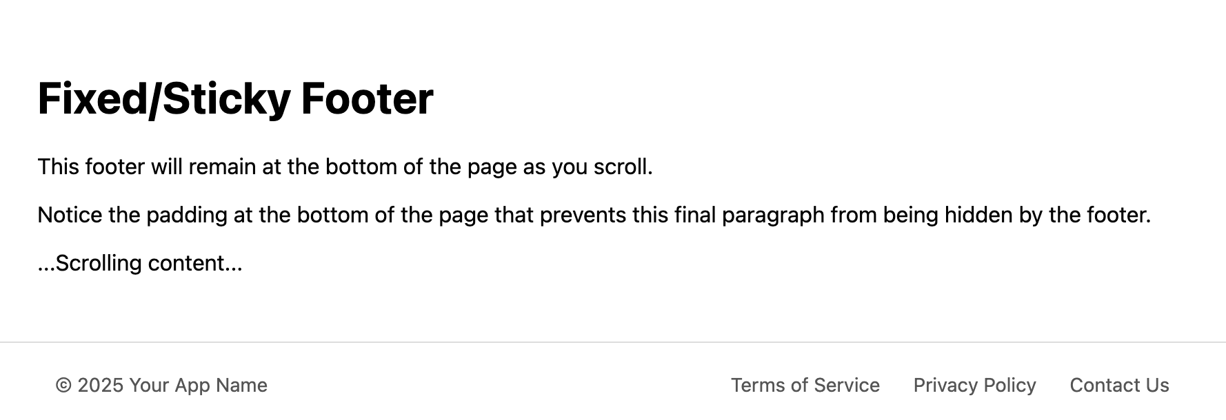
Fixed/Sticky Footer Template
Keep important links and information always in view with this compact fixed (or "sticky") footer.
This template creates a footer bar that always remains visible at the bottom of the browser window, ensuring important links are always accessible without needing to scroll to the end of the page. It's perfect for web applications or sites that need to provide persistent navigation or display critical information like a cookie notice.
About this Fixed Footer Template
A fixed or "sticky" footer is locked to the bottom of the viewport, remaining in a consistent, visible position as the user scrolls up or down the page. This template offers a clean and simple implementation of this pattern. It's designed to be unobtrusive while keeping important links readily accessible. The layout uses Flexbox to neatly arrange a copyright notice and a small set of navigation links.
Features
- Persistent Visibility: The footer stays fixed to the bottom of the viewport using
position: fixed. - Compact & Unobtrusive: A slim design ensures it doesn't take up too much valuable screen real estate.
- Content Padding: The template includes a crucial CSS rule to add padding to the bottom of the
body, preventing the fixed footer from overlapping and hiding the last bit of page content. - Clean & Modern: A simple, versatile design that can be easily styled to fit any website.
- Responsive: The links and copyright text stack on small screens for readability.
Ideal Use Cases
- Web applications or dashboards with persistent navigation.
- Displaying a cookie consent or privacy notice bar.
- Single-page applications (SPAs).
- Websites with "infinite scroll" where a traditional footer would never be reached.
Code Breakdown
The key to this template is the CSS applied to the .footer-fixed element: position: fixed; bottom: 0; left: 0; width: 100%;. This removes the footer from the normal document flow and locks it to the bottom of the browser window.
A critical and often-forgotten part of implementing a fixed footer is accounting for the space it occupies. Without a countermeasure, the footer would obscure the content at the very bottom of the page. This template solves that by adding a padding-bottom to the body that is equal to (or greater than) the height of the footer. A CSS variable, --footer-height, is used to ensure these values stay in sync.
Code
Here's the full code for the footer template: