Split Logo & CTA Footer Template
Drive user action and reinforce your brand with this bold, split-layout footer.
This minimalist yet bold design dedicates space to two important elements: your brand identity on the left and a compelling call-to-action on the right. It's a perfect, uncluttered closing statement for any action-oriented website.
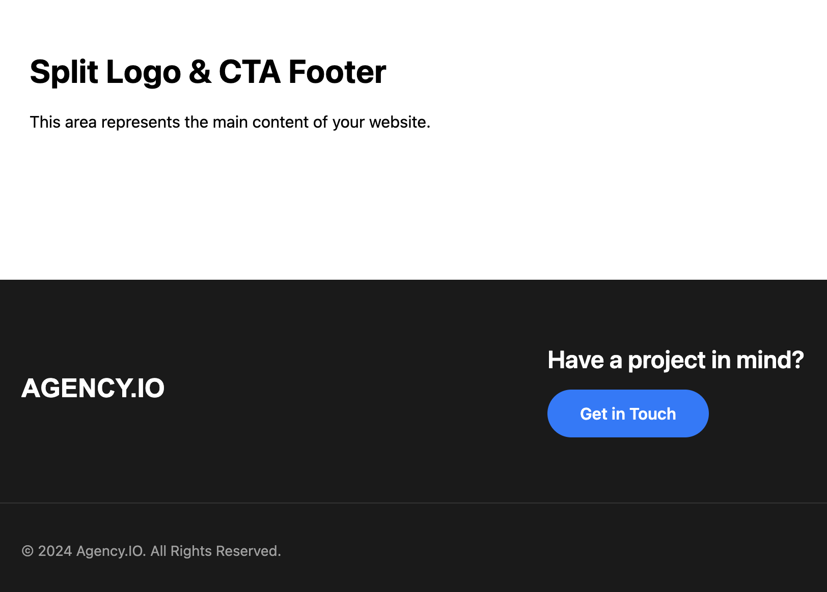
About this Split Footer Template
This footer strips away clutter to focus more on brand recognition and user conversion. The split layout creates a dynamic visual tension that draws the user's eye across the page. A prominent heading and a high-contrast button make the call-to-action impossible to miss, while a separate, thin copyright bar below keeps legal information unobtrusive.
Features
- Action-Oriented Design: The layout is built to funnel users towards a final, key action.
- Modern & Clean Aesthetic: A minimalist approach that feels current and professional.
- Responsive Layout: Uses Flexbox to seamlessly transition from a stacked layout on mobile to a side-by-side layout on desktops.
- High-Contrast CTA: The button is designed to stand out and encourage clicks.
- Easy to Customize: Quickly change the brand logo, CTA text, button color, and link.
Ideal Use Cases
- Creative and Digital Agencies
- Startups and Tech Companies
- Product or Service Landing Pages
- Portfolios with a "Hire Me" or "Let's Work Together" goal.
Code Breakdown
The primary container, .footer-split__main, is a Flexbox container. On mobile, it defaults to a stacked column layout (flex-direction: column) with centered items. A media query for screens wider than 768px changes the layout to a row (flex-direction: row) and uses justify-content: space-between to push the brand and CTA to opposite ends. The align-items: center property ensures they remain vertically aligned.
A separate, slim .footer-split__bottom-bar is used for the copyright notice, keeping it distinct from the main interactive elements.
Code
Here's the full code for the footer template: