Classic Three-Column Footer Template
Organize your site's key navigation and information with this timeless three-column footer design.
Ideal for corporate sites, e-commerce stores, and content-rich blogs, this template provides a clear, user-friendly sitemap at the bottom of every page, enhancing navigation and user engagement.
About this Footer Template
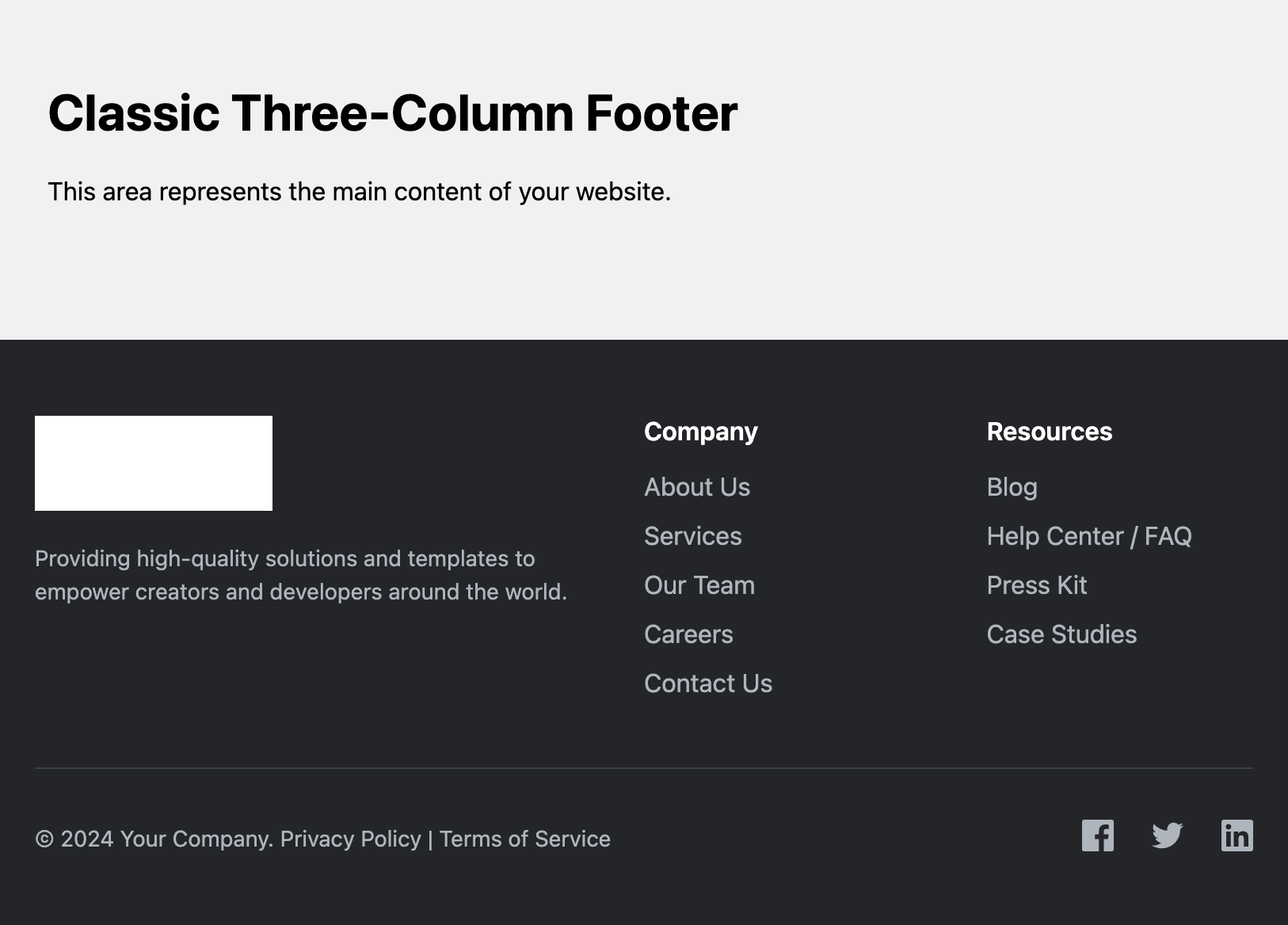
This is the quintessential "workhorse" footer, suitable for a vast range of websites. It features a main section with three columns to neatly organize information, and a separate sub-footer bar below for copyright notices and social media links. This two-part structure creates a clean separation between primary sitemap links and secondary legal/social information.
Features
- Classic & Professional Layout: A trusted design pattern that users instantly recognize and know how to use.
- Responsive Grid System: Built with CSS Grid, the columns stack vertically on mobile devices for perfect readability and transform into a three-column layout on larger screens.
- Brand & Link Sections: The first column is dedicated to your brand's logo and mission, while the other two are perfect for "Quick Links", "Resources", or "Contact" lists.
- Detached Sub-Footer: A clean bottom bar handles copyright (using
©) and social media links, keeping the main footer area tidy. - Fully Accessible: Uses semantic HTML, appropriate headings, and accessible names for all icons and logos.
- SVG Logo & Icons: Ensures your branding is crisp and scalable on all devices.
Code Breakdown
This template consists of a main footer element which contains two primary children: .footer-classic__main and .footer-classic__bottom.
The .footer-classic__main element is a CSS Grid container. On mobile, its grid-template-columns property is set to 1fr, creating a single column. For screens wider than 768px, a media query updates this property to 2fr 1fr 1fr, creating the classic three-column layout where the first column (for the brand) is twice as wide as the other two.
The .footer-classic__bottom bar uses Flexbox to align its content, stacking items on mobile and arranging them horizontally with justify-content: space-between on larger screens. A general CSS rule (.footer-classic a) ensures all links within the footer share the same text color for consistency.
Accessibility Note on SVG Logos
You'll notice the placeholder svg logo contains a title element. This text is not visible in the browser but is crucial for accessibility. It provides a text alternative for screen readers, just like the alt attribute on an image, ensuring that all users understand the purpose of the graphic.
Code
Here's the full code for the footer template: