Two-Tiered Footer Template
Create a clean, hierarchical design by separating primary navigation from secondary info with this two-tiered footer.
This layout is perfect for professional websites that need to present a lot of information in a structured, easy-to-digest format. The distinct visual separation between the main content tier and the bottom bar adds a touch of sophistication.
About this Footer Template
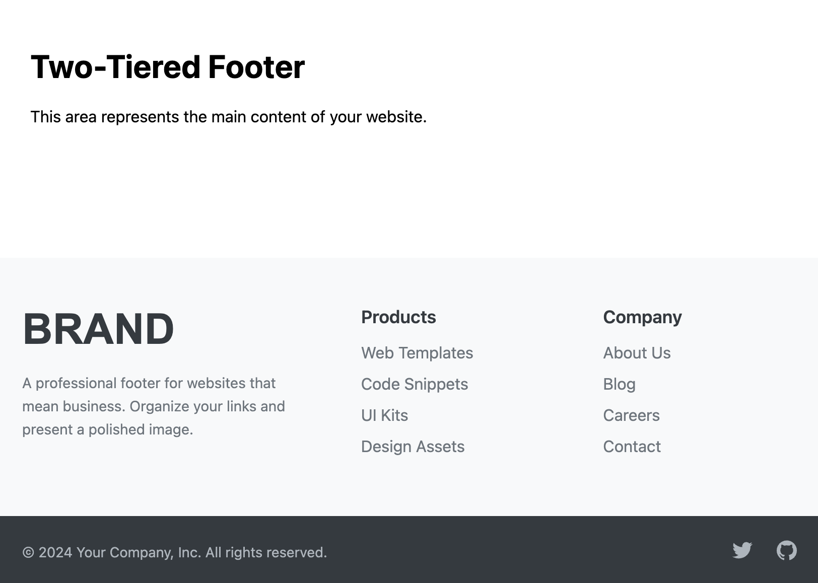
The two-tiered footer creates an excellent visual hierarchy. The upper, larger tier serves as the main information hub, containing navigation links, contact details, or other important sitemap elements. The lower, slimmer tier (or sub-footer) is dedicated to less critical information like the copyright notice and social media icons, creating a polished and uncluttered final element for your page.
Features
- Strong Visual Hierarchy: Distinct background colors for each tier clearly separate primary and secondary information.
- Organized & Professional: The structured layout projects a clean, corporate, and trustworthy image.
- Hybrid Layout: Powerfully combines CSS Grid for the multi-column top tier and Flexbox for the simple bottom tier.
- Fully Responsive: Both tiers adapt seamlessly, stacking elements vertically on mobile devices for optimal readability.
- Easy Theming: Colors for both tiers, text, and links are controlled by simple CSS variables.
Ideal Use Cases
- Professional Services (Law firms, accounting, consulting)
- Corporate Websites
- SaaS and Software Companies
- Educational and Government websites
- Any project where a clean, organized information structure is paramount.
Code Breakdown
The template is built around a main footer element containing two direct children: .footer-twotier__top and .footer-twotier__bottom.
The .footer-twotier__top section uses CSS Grid for its layout. On mobile devices, it defaults to a single column. A media query for screens wider than 768px changes the grid-template-columns property to create a three-column layout.
The .footer-twotier__bottom section uses Flexbox. Its flex-direction is set to column for mobile (stacking items) and switches to row on larger screens, using justify-content: space-between to push the copyright and social links to opposite ends.
Code
Here's the full code for the footer template: